Summary
- Color theory studies how colors interact, are perceived, and affect emotions, combining scientific approaches with artistic, subjective perspectives.
- Color theory has developed over centuries; from ancient symbolic uses to Newton’s optical discoveries, Goethe’s studies of perception, Chevreul’s contrast principles, and later systematic approaches by Munsell, Itten, and Albers, tracing the evolving understanding of color through time.
- The color wheel, introduced by Newton, shows how colors relate and interact. In the RYB model, primary colors mix to form secondary and tertiary hues, giving artists a full palette and guiding harmony, contrast, and visual impact.
- Every color is defined by three key attributes: hue, saturation, and lightness, which together determine its character and impact within a composition.
- These attributes interact closely, with changes to one affecting the others. Artists use this interplay to create complex effects.
- Color harmonies combine colors for visual appeal and emotional impact. The right harmony shapes mood, emphasis, and composition.
- Colors are seen as warm or cool, influencing emotion and space. Their understanding helps artists shape mood, focus, and depth.
- Color influences emotions and behavior. Artists use associations of colors to enhance impact.
- Color behaves differently by medium, and understanding additive versus subtractive mixing helps artists achieve their intended effect.
- Color theory comes alive when artists apply it to composition, emotion, and narrative. From Impressionists and Fauvists to Bauhaus practitioners and contemporary artists like Rothko and Kusama, color transforms theoretical knowledge into expressive, living art.
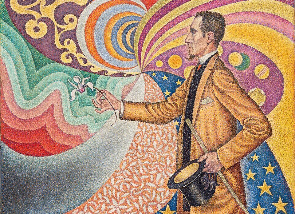
- Post-Impressionism shifted focus from fleeting light to deeper meaning, structure, and emotion. Seurat and Signac applied Pointillism, placing dots of pure color to achieve luminosity and harmony, while van Gogh used bold colors to convey psychological intensity. These approaches show color as both expressive and experimental.
- Fauvism (Matisse, Derain) revolutionized color, using intense, non-naturalistic pigments to convey emotion rather than reality.
- Orphism (Robert and Sonia Delaunay) used pure hues and Simultanism—the interaction of adjacent colors—to create rhythm and motion in both art and everyday objects.
- De Stijl (Mondrian, van Doesburg) sought harmony through abstraction, using lines, planes, and primary colors.
- The Bauhaus (Itten, Kandinsky, Klee, Albers) reshaped color theory through experimental art and design teaching.
- Color field painting (Rothko, Newman, Frankenthaler) emphasized large areas of color to create immersive, emotional experiences.
Rather than being a fixed set of rules, color theory is a dynamic field that continuously evolves. It explores how colors interact, how they are perceived by the human eye, and how they affect our emotional responses. Importantly, there is no single, unified color theory; instead, multiple perspectives coexist to capture the complexity of this phenomenon. This traces the conceptual foundations and historical evolution of color theory, highlighting its dual nature—a constant dialogue between scientific objectivity and human subjectivity. On one hand, figures like Isaac Newton laid the groundwork through optical science. On the other, thinkers and artists such as Goethe, Matisse, and Josef Albers emphasized perception, emotion, and experience. This ongoing tension not only deepens our understanding of color but also reveals it as both a measurable and profoundly personal phenomenon.
A Spectrum of Color Through Time
Color theory has evolved over the centuries through a rich interplay of empirical observation, practical need, and philosophical reflection. Since ancient times, civilizations like Egypt and Mesopotamia assigned symbolic meaning to color. Aristotle linked colors to the elements, viewing them as combinations of light and darkness. During the Renaissance, Leonardo da Vinci redefined color as a material property, classifying hues according to elemental associations and applying his findings in techniques such as sfumato.
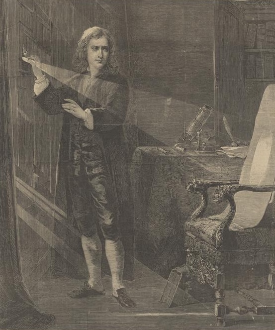
J. A. Houston, Newton Experimenting with Light from Harper’s Weekly, July 2, 1870, MIT Museum, Cambridge, MA, USA.
A scientific shift emerged with Isaac Newton, who discovered that white light splits into a chromatic spectrum (ROYGBIV). He also designed the first color wheel, marking a foundational moment in modern optics. Later, Johann Wolfgang von Goethe offered an opposing theory, focusing on perception and the emotional resonance of color, thus connecting it closely with psychology. Meanwhile, Michel-Eugène Chevreul, working in the textile industry, formulated the The Laws of Contrast of Colour. His findings revealed how colors influence each other in visual contexts—insights that later shaped the work of the Impressionists.
Albert Munsell developed a three-dimensional color system based on hue, value, and chroma. This system provided a precise and objective tool for color communication, becoming highly influential in modern color science. Some decades later, Josef Albers advocated for an experimental approach to teaching color. His method focused on relative perception, as demonstrated in Interaction of Color and his Homage to the Square series. Johannes Itten, a key figure at the Bauhaus, further enriched the discipline by integrating scientific principles with spiritual influences. His color wheel, based on red, blue, and yellow as primary colors, introduced contrasts such as warm versus cool and simultaneous contrast. His holistic method—combining theory, practice, and psychology—greatly influenced Albers and helped shape modern color pedagogy.
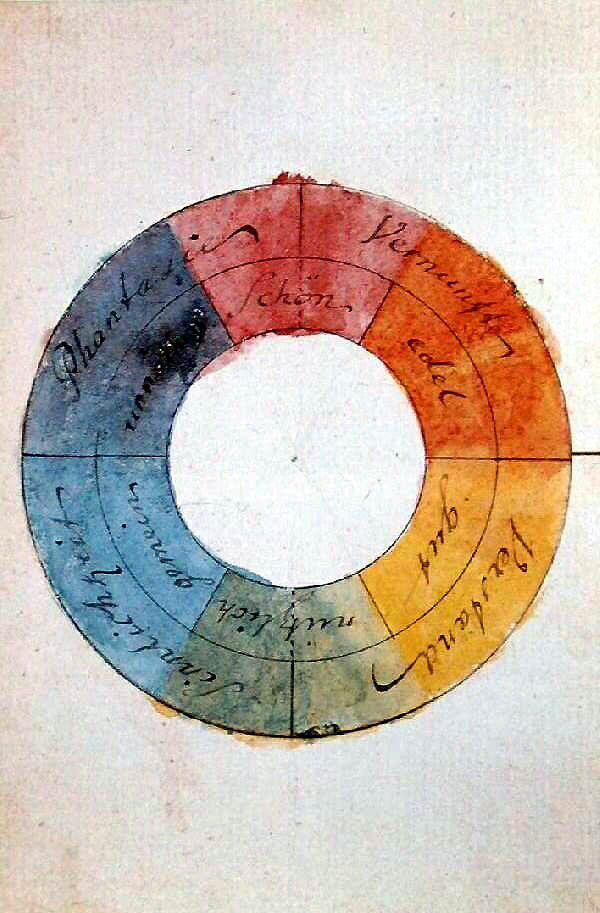
Johann Wolfgang von Goethe, Chromatic circle, 1809, Freies Deutsches Hochstift, Goethe House, Frankfurt, Germany. Wikimedia Commons (public domain).
The Chromatic Compass—Understanding the Color Wheel
Color theory relies heavily on the color wheel to explain how colors relate and interact. Isaac Newton first introduced the concept after experimenting with white light and prisms. He noticed the spectrum of colors and arranged them in a circular format. His discovery laid the groundwork for one of the most enduring tools in visual arts and design.
What Is the RYB Color Model?
The traditional RYB (Red, Yellow, Blue) model dominates pigment-based visual arts. Artists, designers, and educators have long used it to create color harmony and contrast.
Primary Colors: The RYB model identifies red, yellow, and blue as primary colors. These three hues form the foundation because no mix of other colors can produce them. Artists use them to generate every other color on the wheel.
Secondary Colors: Mixing two primary colors in equal parts results in secondary colors. For example:
-
Blue + Yellow = Green
-
Red + Yellow = Orange
-
Red + Blue = Violet
These hues expand the range of possibilities in both painting and design.
Tertiary Colors: Artists create tertiary colors by blending a primary color with a neighboring secondary color on the wheel. Examples include:
-
Yellow-green
-
Red-violet
-
Blue-orange
These nuanced tones offer depth and variety in any composition.
Why the Color Wheel Matters?
The color wheel does more than display colors; it helps artists and designers make informed choices. By showing how colors complement or contrast with one another, the wheel serves as a powerful guide for creating visual balance, emotional impact, and aesthetic appeal.
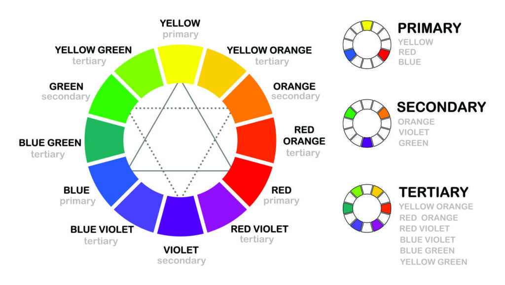
Color wheel including secondary and tertiary colors. Printex.
The Anatomy of Color: Hue, Saturation, and Lightness
Every color can be described using three fundamental attributes: hue, saturation, and lightness. These elements work together to define a color’s character and impact within a composition.
Hue—The Identity of Color: Hue refers to the quality that distinguishes one color from another. It represents the pure state of a color—the way we commonly name it: red, yellow, blue, and so on. Artists and designers rely on hue to establish the emotional and symbolic tone of their work.
Saturation—The Intensity of a Color: Saturation (also known as chroma or intensity) describes how pure or vivid a color appears. Highly saturated colors look bright and bold, while those with low saturation appear muted or grayish. Changes in saturation can dramatically affect a design’s mood and focus.
Lightness (Value)—The Brightness of a Color: Lightness, also called value or brightness, indicates how light or dark a color is on a scale from white to black. It plays a key role in creating spatial effects, contrast, and form definition within a visual composition.
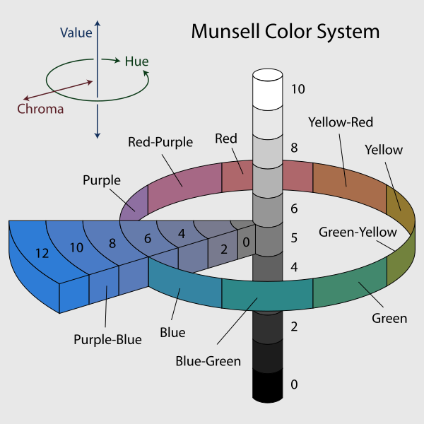
A diagram of the Munsell Color System. The image shows: The neutral values in steps of 1 from 0 to 10; A circle of 10 hues at value 5 and chroma 6; The chromas of purple-blue in steps of 2 from 0 to 12, at value 5. © 2007, Jacob Rus via Wikimedia Commons (CC BY-SA 3.0).
The Interplay Between Hue, Saturation, and Lightness
These three attributes rarely act in isolation. Adjusting one often alters the perception of the others. Artists frequently use this interdependence to create subtle and complex effects. For instance, Albert Munsell’s color system arranges hue, value, and chroma in a three-dimensional space, acknowledging that not all hues can achieve the same level of saturation across every value. A highly saturated yellow naturally appears brighter than a similarly saturated blue.
When artists add white to produce a tint, black to create a shade, or gray to mute saturation, they are simultaneously altering both the color’s value and its intensity—and sometimes even its perceived hue. Techniques like “dirtying” a color by adding its complementary—explored by Chevreul—reduce saturation and affect brightness as well. Therefore, mastering color requires more than knowing each variable. It demands an understanding of their interconnected behavior. Recognizing and manipulating these dynamics allows artists and designers to move beyond basic theory and achieve sophisticated color expression.
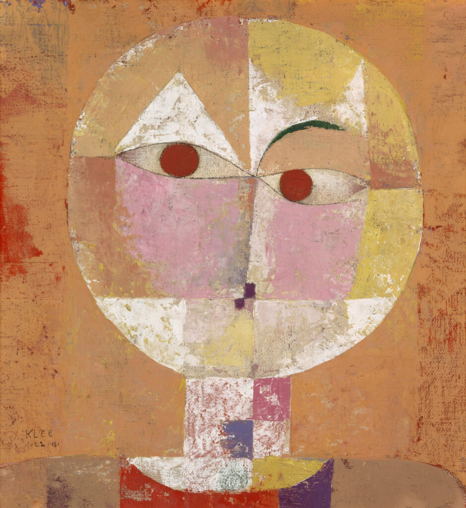
Paul Klee, Senecio (Baldgreis), 1922, Kunstmuseum Basel, Basel, Switzerland.
Orchestrating Hues: Color Harmonies and Their Impact
Color harmonies refer to combinations of colors that appear visually pleasing based on their relative positions on the color wheel. Artists and designers use these harmonies to create balance, unity, emphasis, or to evoke specific emotional responses. Choosing the right harmony can dramatically enhance a composition’s effectiveness.
Complementary Harmony: This scheme pairs colors that sit directly opposite each other on the color wheel—such as red and green. It delivers the highest contrast and creates a vibrant, energetic effect. Many use it to make focal points stand out boldly.
Analogous Harmony: Analogous combinations use colors that lie next to each other on the wheel—for example, blue, blue-green, and green. This approach fosters a cohesive and calming aesthetic, often found in nature-inspired designs.
Triadic Harmony: Formed by selecting three evenly spaced colors on the wheel, a triadic scheme—like red, yellow, and blue—offers vibrant, yet balanced combinations. Designers often choose it to maintain visual interest without overwhelming the viewer.
Monochromatic Harmony: A monochromatic palette involves variations in saturation and lightness of a single hue. As a result, it produces a clean, elegant, and harmonious look, ideal for minimalist compositions or subtle emotional tones.
Tetradic (Rectangular) Harmony: This harmony involves two complementary color pairs, creating a rich and dynamic palette. While it offers great diversity, it requires careful balance to avoid visual chaos.
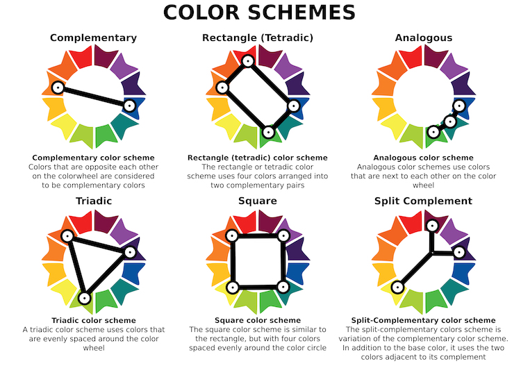
Color schemes. From left to right, top to bottom: complementary, tetradic, analogous, triadic, square, split-complementary. Women’s Networking Alliance.
Selecting the Right Harmony
The choice of color harmony depends on the artist’s intent. To create strong emphasis, complementary colors may work best. For a soothing atmosphere, analogous or monochromatic schemes prove more effective. Meanwhile, triadic harmonies bring balanced dynamism, and tetradic combinations allow for intricate contrasts. Ultimately, understanding and applying these harmonies helps orchestrate mood, movement, and meaning within any visual composition.
The Emotional Thermometer: Warm and Cool Colors
Colors are often perceived through the lens of temperature, falling into two primary categories that influence both emotion and spatial perception.
Warm Colors: Warm colors include reds, oranges, and yellows. These hues typically evoke energy, passion, and a sense of closeness. In visual compositions, warm colors tend to advance, drawing the viewer’s attention forward and creating a sense of immediacy.
Cool Colors: On the other hand, cool colors—such as blues, greens, and violets—convey calmness, introspection, and depth. These tones usually recede in a composition, offering a more distant or tranquil feeling.
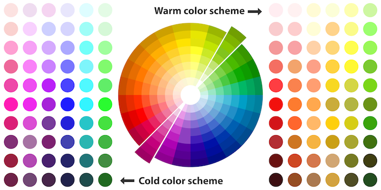
Cool and warm color scheme. Science of Style.
Theoretical Background
In the early 20th century, theorist Wilhelm Ostwald formalized this distinction between warm and cool colors. Since then, professionals across various fields—including art, design, and psychology—have adopted and applied it extensively. By understanding the emotional temperature of color, artists and designers can strategically guide mood, focus, and spatial dynamics within their work.
Color and the Psyche
It’s undeniable that color influences human emotions, perceptions, and even behaviors. Color psychology explores these connections, helping us understand how certain hues can affect mood and decision-making. However, it’s important to recognize that cultural contexts often shape these associations. In Western cultures, some common meanings include:
-
Red: passion, energy, urgency, love, danger
-
Blue: calm, trust, serenity, professionalism, coldness, sadness.
-
Yellow: joy, optimism, energy, warning
-
Green: nature, growth, freshness, health, balance
-
Orange: enthusiasm, creativity, warmth
-
Violet: luxury, spirituality, mystery
Artists intentionally apply these emotional associations to strengthen the message of their work and provoke specific responses from viewers.
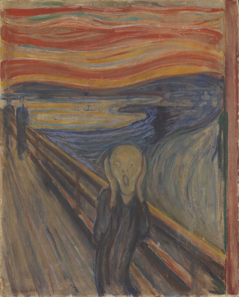
Edvard Munch, The Scream, 1893, National Museum of Norway, Oslo, Norway.
The Role of Color Models in Artistic Practice
Color is not a fixed or universal entity; rather, it behaves differently depending on the medium and mixing method. Several color models reflect these variations:
-
RYB (Red, Yellow, Blue): Used for traditional pigment-based art
-
RGB (Red, Green, Blue): Used in digital screens and additive color mixing
-
CMYK (Cyan, Magenta, Yellow, Black): Used in print media with subtractive mixing
In the RGB model, light colors combine additively. Mixing red, green, and blue at full intensity produces white light. In contrast, RYB and CMYK are subtractive models. Here, pigments absorb certain wavelengths and reflect others, meaning that combining pigments removes light—leading to darker colors or black.
As early as the 18th century, Jacob Christoph Le Blon recognized this distinction. He identified “material colors” (subtractive) and “colored light” (additive), laying the groundwork for modern color theory. These systems exist because of fundamental physical differences in how color is produced and perceived across media. Therefore, artists and designers must carefully choose the appropriate model based on their intended outcome. This highlights that color theory isn’t just theoretical—it also offers practical, goal-oriented tools essential for effective visual communication.
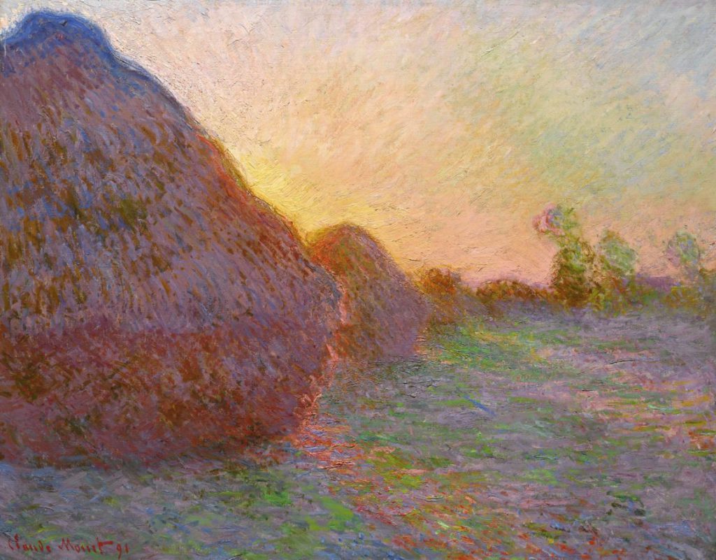
Claude Monet, Meules, 1890, Museum Barberini, Potsdam, Germany.
Living Canvases with Theory
The transition from theoretical principles to practical and expressive application on canvas reveals the true vitality of color theory. Artists, whether through intuitive choices or deliberate exploration, have consistently embraced—and at times challenged—these principles to craft powerful and unique visual languages. Moreover, throughout art history, color has served not only as a compositional element but also as a narrative and emotional force. For example, the Impressionists revolutionized color use by rejecting traditional black shadows and instead applying complementary colors to depict light and atmosphere. Likewise, Fauvist painters like Henri Matisse boldly exaggerated hues to express emotion rather than depict reality. The Expressionists used intense and often discordant colors to convey psychological depth and inner turmoil.
In contrast, the Bauhaus movement approached color with scientific precision, aligning with the teachings of Johannes Itten and Josef Albers to explore color interaction and functionality. Modern and contemporary artists continue to reinterpret color theory in innovative ways. From Mark Rothko’s immersive color fields to Yayoi Kusama’s polka-dot installations, color acts as both structure and sensation, bridging the gap between perception and experience.
Ultimately, these examples demonstrate that color theory is not static or confined to textbooks. Instead, it evolves through creative application. As a result, every brushstroke infused with chromatic intention becomes a living dialogue between science and sensibility, transforming theoretical knowledge into artistic expression.
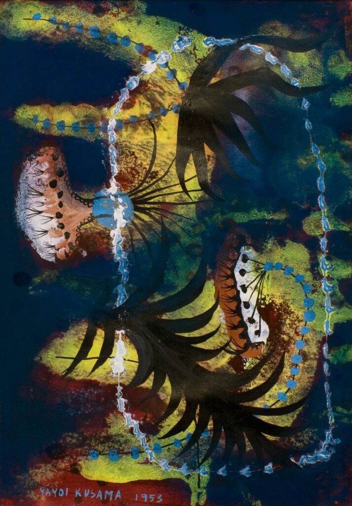
Yayoi Kusama, Fern Kingdom, 1953, private collection. National Gallery of Victoria.
Post-Impressionism: Expressive Power and Scientific Application
Post-Impressionism emerged both as an extension of and a reaction to the perceived limitations of Impressionism. While Post-Impressionist artists continued to use vibrant colors, they shifted their focus in several key ways. For one, they placed greater emphasis on geometric forms and structure. Additionally, they deliberately distorted shapes to enhance emotional expression. Unlike the Impressionists, who aimed to capture fleeting moments of light and atmosphere, Post-Impressionists sought deeper meaning and symbolic content.
Moreover, many artists began to use unnatural or arbitrary colors to convey inner states or spiritual themes, or to achieve a formal balance. This approach allowed them to push beyond mere visual representation and explore the psychological and conceptual power of color. As a result, Post-Impressionism marked a significant turning point in modern art. By blending expressive intent with scientific exploration of form and color, artists such as Vincent van Gogh, Paul Cézanne, and Paul Gauguin paved the way for future movements like Expressionism, Fauvism, and Cubism.
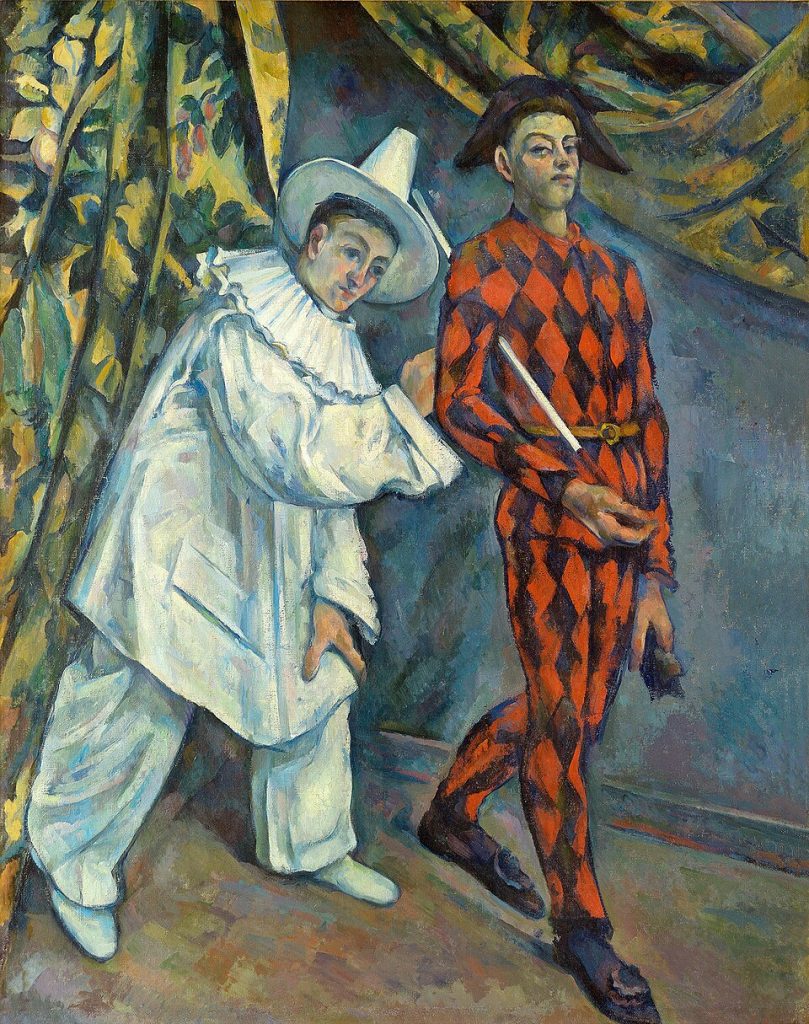
Paul Cézanne, Pierrot and Harlequin, 1898, Pushkin Museum of Fine Arts, Moscow, Russia. Wikimedia Commons (public domain).
Pointillism
Pointillism, also known as Divisionism, was a technique used by Neo-Impressionists, grounded in scientific color theory—specifically the optical mixing principles proposed by Michel Eugène Chevreul and Ogden Rood. Instead of blending pigments physically, artists applied small dots or strokes of pure color, allowing the viewer’s eye to mix them optically. As a result, this method created greater luminosity and vibrancy on the canvas.
Seurat and the Precision of Light
Georges Seurat (1859–1891), the leading figure of Neo-Impressionism, exemplified Pointillism in his masterpiece A Sunday on La Grande Jatte. In this work, each dot of color was strategically placed to produce harmony and evoke light effects with scientific precision. Interestingly, Seurat used zinc yellow pigment, which later underwent chemical changes, altering some areas of the painting over time.
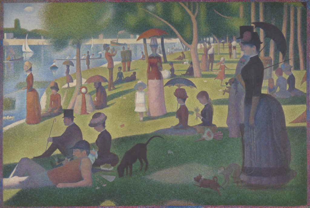
Georges Seurat, A Sunday on La Grande Jatte—1884 , (1884–1886), Art Institute of Chicago.
Signac and Chromatic Harmony
Paul Signac (1863–1935), another key Neo-Impressionist, followed similar principles. In The Port at Sunset, Opus 236 (Saint-Tropez), his use of complementary colors like violet and orange generates a visual vibration that captures the sensation of fading sunlight. Furthermore, by labeling his works as “Opus,” Signac emphasized his intent to create musical harmony through color composition.
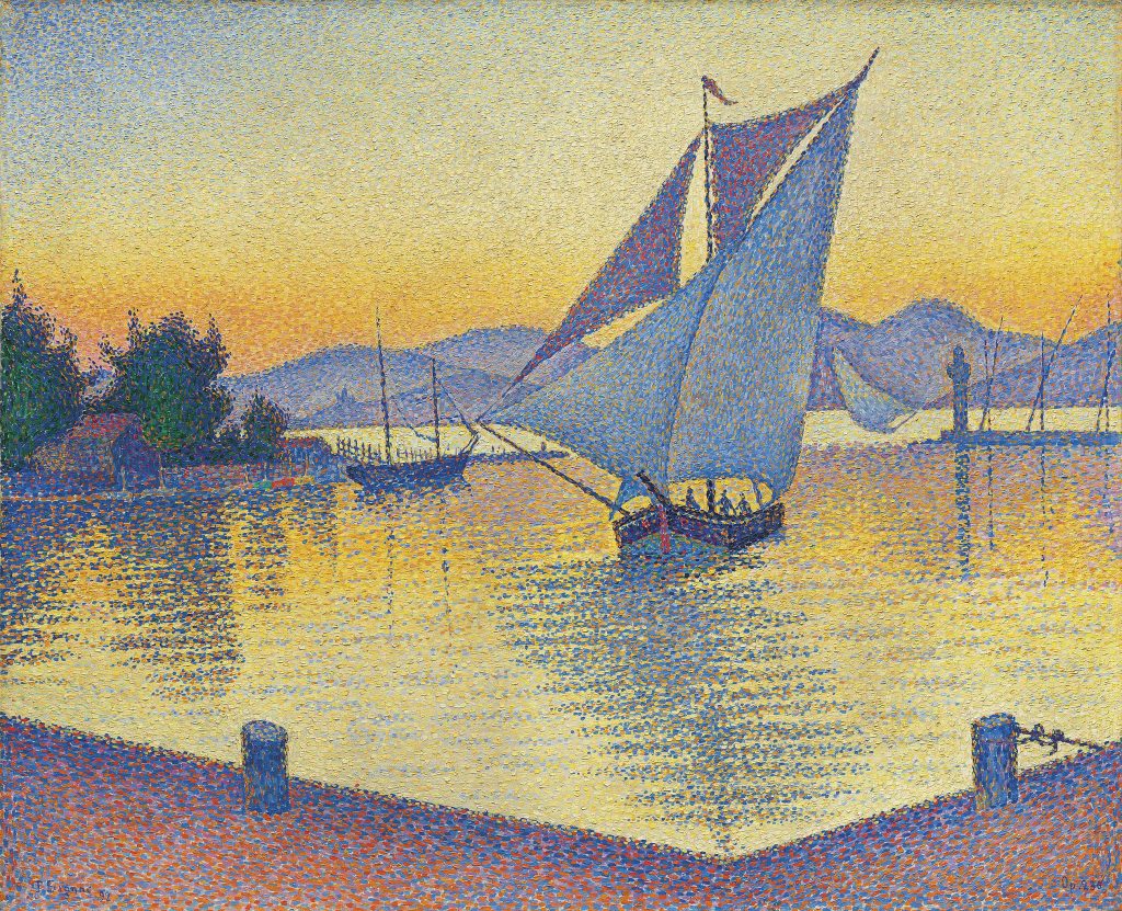
Paul Signac, The Port at Sunset, Opus 236 (Saint-Tropez), 1892, Museum Barberini, Potsdam, Germany.
Van Gogh and Emotional Color
In contrast, other Post-Impressionists used color more subjectively to convey emotion. Vincent van Gogh (1853–1890) famously infused his paintings with psychological depth through bold, expressive color choices. In The Night Café, he deliberately clashed reds, greens, and yellows to depict a suffocating, chaotic atmosphere. He described it as a “hellish furnace” where one might “go mad or commit a crime.”
Similarly, The Starry Night reveals Van Gogh’s intense emotional state through swirling blues and luminous yellows. During his time in Arles, his palette shifted dramatically toward yellow—a change possibly influenced by the region’s sunlight and his medical conditions.
Fauvism: The Liberation of Color
At the dawn of the 20th century, Fauvism burst onto the art scene with bold, revolutionary use of color. Les Fauves—or “wild beasts”—completely broke away from traditional, representational color usage. Instead, they embraced intense, often pure pigments straight from the tube, applied in non-naturalistic and arbitrary ways. As a result, color became an independent expressive element used to evoke emotion and energy, rather than depict objective reality.
Matisse and the Power of Feeling
Henri Matisse (1869–1954), one of the movement’s leading figures, selected colors based on observation, feeling, and personal sensitivity—not scientific theory. In The Joy of Life, vibrant blues, reds, and greens fill an idyllic landscape with expressive brushwork and flat color fields, creating a euphoric harmony with nature. Likewise, in Harmony in Red, the bold red wallpaper and tablecloth flatten the space and immerse the viewer in a rhythmic, decorative world.
Derain and the Fauvist Breakthrough
André Derain (1880–1954), alongside Matisse, played a key role in the development of the movement, particularly during the pivotal summer of 1905 in Collioure. Paintings like Fishing Boats, Collioure showcase their shared experimentation with pure color and simplified forms. Fauvism liberated color from its descriptive role and redefined it as a tool for emotion, rhythm, and sensation. This radical shift would influence countless modern art movements in the years to follow.
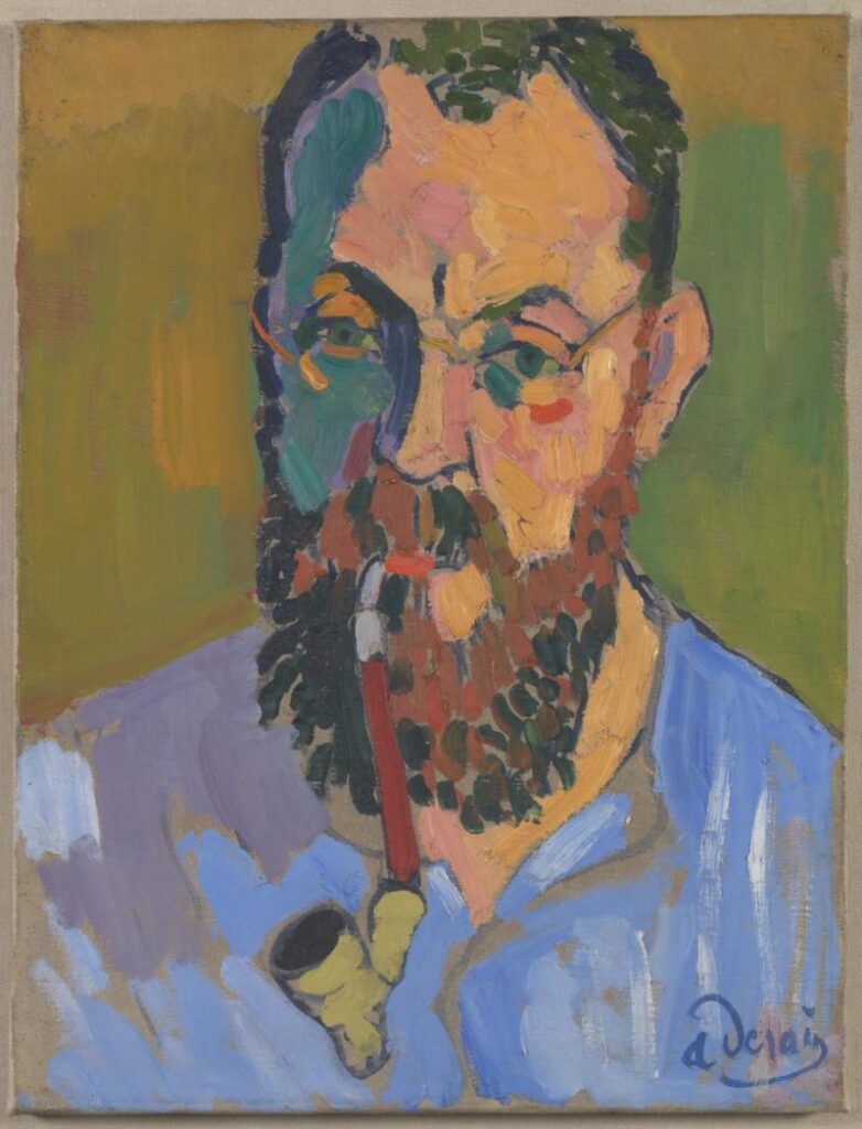
André Derain, Henri Matisse, 1905, Tate, London, UK.
Orphism: Musicality, Abstraction, and Simultanism
Emerging around 1912, Orphism developed as a vibrant offshoot of Cubism, placing renewed emphasis on bright color, rhythm, and movement. Influenced by Chevreul’s theory of simultaneous contrast, as well as Neo-Impressionist and Symbolist ideas, Orphism elevated color to a central role in artistic expression.
Key Concepts of Orphism
Pure Color and Abstraction: Orphist artists treated color as the main subject of painting. Rather than relying on representation, they used pure hues to directly express emotion and convey a deeper sense of reality. This approach led to fully abstract, non-objective compositions.
Simultanism (Simultanéisme): Rooted in Chevreul’s theories, Simultanism refers to how adjacent colors affect each other, generating visual dynamism, spatial depth, and a layered sensory experience—one often compared to music.
Rhythm and Movement: By carefully arranging harmonious color interactions, Orphist works aimed to create visual rhythms akin to musical compositions. This gave their paintings a sense of motion and internal energy.
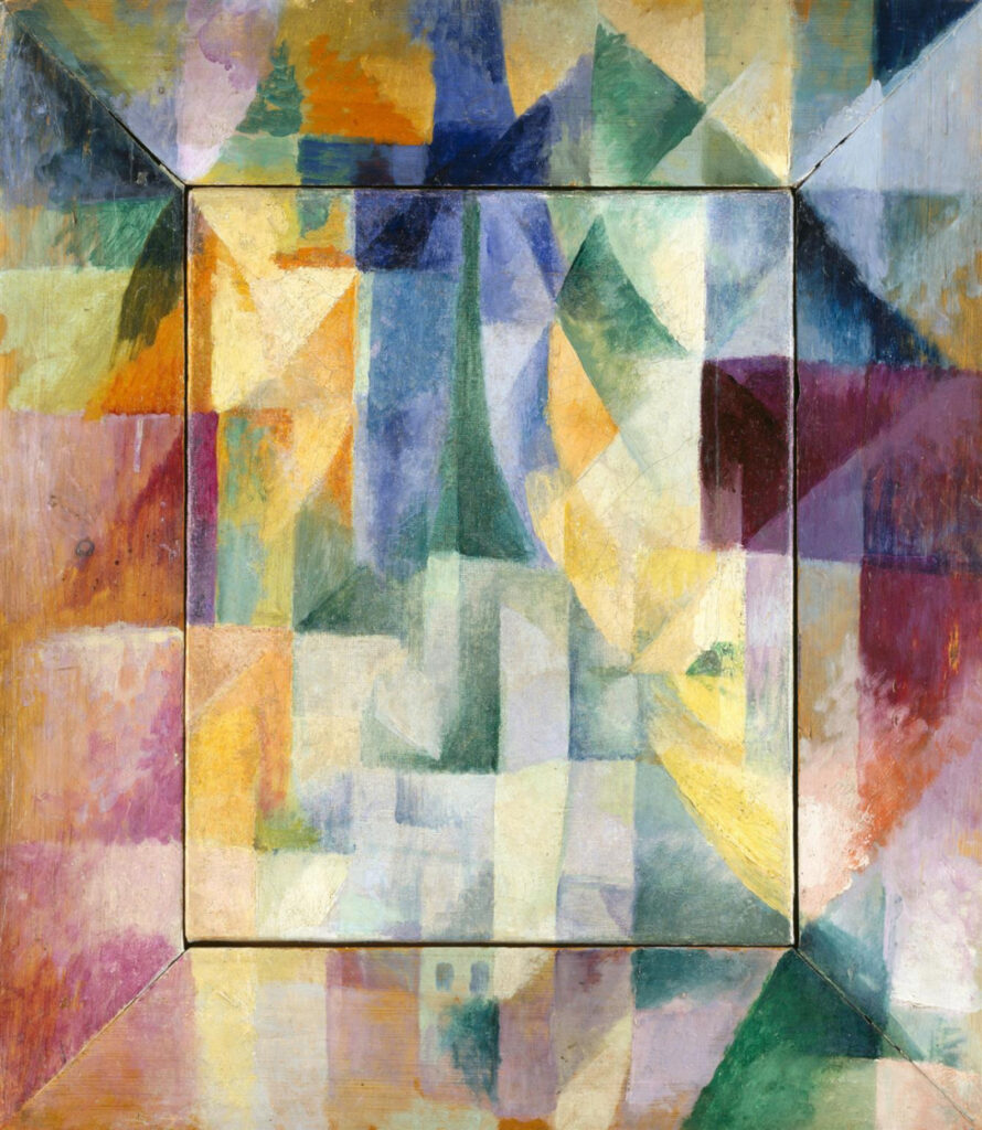
Robert Delaunay, Simultaneous Windows on the City (Les Fenêtres simultanées sur la ville), 1912, Hamburger Kunsthalle, Hamburg, Germany.
The Delaunays and the Expansion of Orphism
Robert Delaunay (1885–1941) believed that colors spoke their own language. He explored this vision in key series such as Windows and Circular Forms, where vibrant tones and fluid shapes generate optical harmony.
His wife, Sonia Delaunay (1885–1979), a co-founder of the movement, expanded Simultanism beyond painting. She applied its principles to textile design, fashion, and stage sets—demonstrating that color theory could enrich everyday life. Her 1911 patchwork quilt stands as an early example of pure abstraction, while Electric Prisms fully embodies Orphism’s aesthetic ideals.
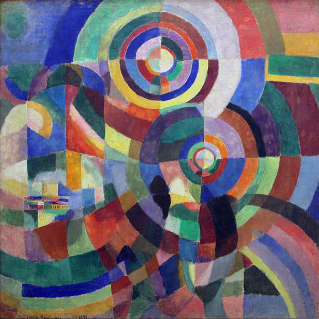
Sonia Delaunay, Electric Prisms, 1914, Musée National d’Art Moderne, Centre Pompidou, Paris, France. Wikimedia Commons (public domain).
De Stijl: Through Primary Colors
Founded in 1917, the Dutch movement De Stijl aimed to achieve universal harmony and absolute order through pure abstraction. To reach this goal, artists stripped visual language down to its most essential elements: straight horizontal and vertical lines, flat planes, and an extremely limited color palette. Their color theory, known as Neoplasticism, relied exclusively on the three primary colors—red, yellow, and blue—along with the non-colors black, white, and gray.
Mondrian and the Pure Balance
Piet Mondrian (1872–1944), the leading figure of De Stijl, developed Neoplasticism as a way to promote visual and spiritual equilibrium. He believed that by reducing art to its purest components, one could reflect the underlying harmony of the universe. Works like Composition with Red, Yellow, and White perfectly illustrate this vision, combining geometric clarity with primary color precision.
Van Doesburg and the Spread of the Movement
Theo van Doesburg (1883–1931) also embraced Mondrian’s minimalist principles. Moreover, he played a crucial role in spreading De Stijl’s ideas through the movement’s influential publication, De Stijl magazine.
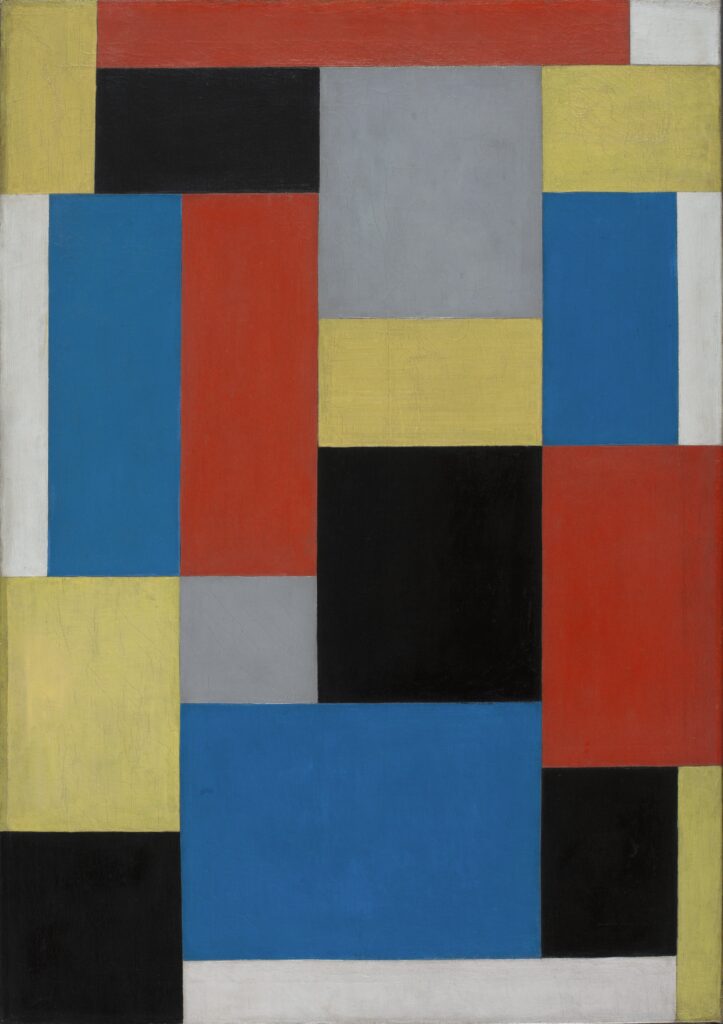
Theo van Doesburg, Composition XX, 1920, Thyssen-Bornemisza Museum, Madrid, Spain.
Bauhaus: Theory and Practice in Color
The Bauhaus, the influential German school of art, design, and architecture, profoundly reshaped how color theory is taught and understood. Its educational philosophy emphasized the integration of fine art, craftsmanship, and design, while also promoting experimental learning and a deep understanding of the core principles of form and color.
Johannes Itten created a 12-hue color wheel and classified seven types of color contrast—including qualitative, quantitative, warm-cool, and complementary. He also pioneered emotional and temperature-based color associations, linking hues to psychological and sensory experiences.
Kandinsky, Klee, and Albers
Wassily Kandinsky (1866–1944) explored the synesthetic connections between color, geometric shapes, and music. In his influential book Concerning the Spiritual in Art, he described color as a force that could directly affect the soul, capable of triggering deep emotional and psychological reactions.
Paul Klee (1879–1940) also approached color musically, thinking in terms of harmony and dissonance. He viewed color as an autonomous tool for shaping and composing, independent of naturalistic representation.
Josef Albers (1888–1976), as previously noted, taught color through direct observation and hands-on experimentation. His renowned Homage to the Square series reflects his lifelong study of color relativity and perceptual effects.
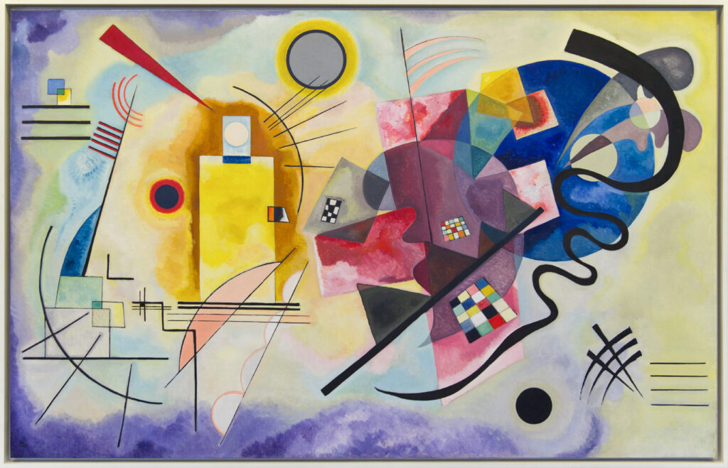
Wassily Kandinsky, Yellow-Red-Blue (Gelb-Rot-Blau), 1925, Musée National d’Art Moderne, Centre Pompidou, Paris, France.
Color Field Painting: Immersive Color Resonance
Emerging in the 1940s and 1950s as a branch of Abstract Expressionism, color field painting focused on large-scale canvases filled with broad, flat areas of solid color. Unlike gestural abstraction, this movement placed emphasis on color over form, using minimal surface detail to create a contemplative, immersive experience for the viewer.
Artists used methods such as staining—pouring diluted paint onto unprimed canvas—as well as hard-edge and soft-edge applications. These techniques allowed the color to become the dominant force, aiming to engage viewers on a deep, emotional level.
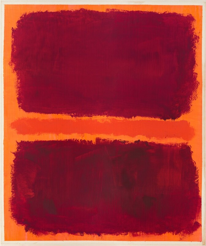
Mark Rothko, Untitled, 1969, National Gallery of Art, Washington, DC, USA.
Rothko, Newman, and Frankenthaler
Mark Rothko (1903–1970), one of the movement’s most iconic figures, painted large canvases featuring softly edged rectangles of color that seem to float and pulse. He believed that color could directly evoke fundamental human emotions—red for intensity, blue for calmness, and yellow or orange for joy and anxiety.
Barnett Newman (1905–1970) introduced vertical bands called “zips” that sliced through color fields, generating tension and spiritual reflection within the space of the canvas.
Helen Frankenthaler pioneered the soak-stain technique, allowing pigment to seep into the canvas fibers. As a result, her works achieved luminous transparency and a unique sense of depth.
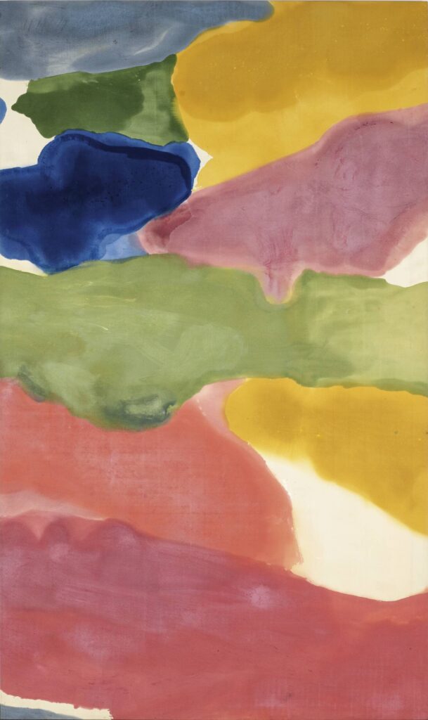
Helen Frankenthaler, Tutti-Frutti, 1966, acrylic on canvas, 296.6 x 175.3 cm, Collection Buffalo AKG Art Museum.
