
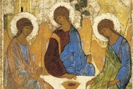
A Beginner’s Guide to Icons in Eastern Christianity
Icons are among the oldest image traditions, yet they often remain misunderstood, especially in the West. They belong to a visual culture that...
Catherine Razafindralambo 27 April 2026
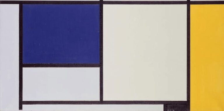
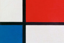
Piet Mondrian, Composition in Blue, White and Yellow, 1927, Denver Art Museum, Denver, CO, USA. Wikimedia Commons (public domain). Detail.
We can all recognize Mondrian’s work in a second. Our eyes navigate through the lines jumping from color to color. His artistic career started with figurative painting and later turned into his characteristic abstract style. But how do we read Piet Mondrian’s creations?
Piet Mondrian was a Dutch theoretician and painter known as the co-founder of the artistic movement De Stijl. He became one of the pioneers of 20th-century abstract art. According to Mondrian, art should be represented by straight lines and pure color, a much more oriented abstract style than that of Kandinsky.
Mondrian reduced his artistic vocabulary to simple geometric elements and a few elementary colors as symbols of the expression of cosmic order. To do so, he removed all textures, curves, or diagonal lines and all formal figures. He created a purified art style. In fact, he even reduced his own name from Pieter Cornelius Mondriaan to Mondrian.
The great struggle for artists is the annihilation of static equilibrium in their paintings through continuous oppositions (contrasts) among the means of expression. It is always natural for human beings to seek static balance. This balance, of course, is necessary to existence in time. But vitality in the continual succession of time always destroys this balance. Abstract art is a concrete expression of such vitality.
Piet Mondrian, The Museum of Modern Art Bulletin, 1946. Excerpted in John Elderfield, (ed.), Modern Painting and Sculpture: 1880-The Present. The Museum of Modern Art, 2004, 207-208.
Indeed, Piet Mondrian wanted to create paintings that could be universally read and art that is direct and reflects visual harmony. That’s the reason why everyone is able to recognize him.

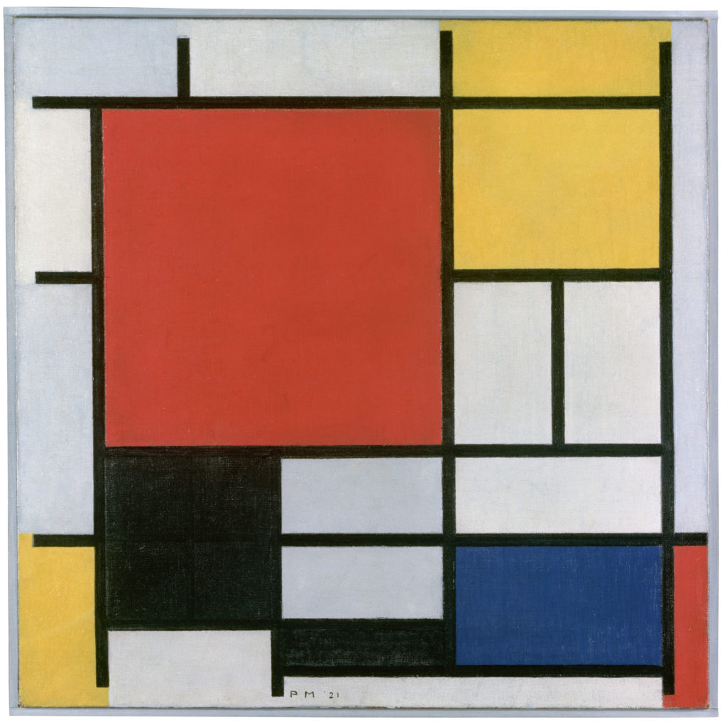
Mondrian started approaching this philosophical theory in 1908. His basic compositions are an exploration of opposing forces. We can interpret the black and white color, and the static and dynamic movements as a confrontation between positive and negative, or feminine and masculine. Mondrian’s neoplastic art is an instrument that aims to help us reach our inner balance.
Mondrian started using the beauty of lines while living in Paris. It was something apparently simple but really complex in significance as we have already seen. In Tableau II, the grid has a centrifugal composition. Our eye reads this image in a clockwise direction. We travel around the black lines that frame the white center, surrounded by small colored rectangles.
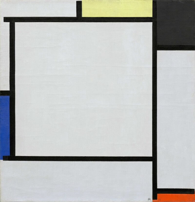
As a matter of fact, the lines generate really powerful images by themselves. Those of you who have seen a Mondrian painting in situ might know that it is not the same as seeing his painting on a screen. The lines are not as perfectly edged as they appear on the screen, and the dimensions of his pieces also transport us to different feelings. Did you know that Mondrian never used a ruler to create his lines?
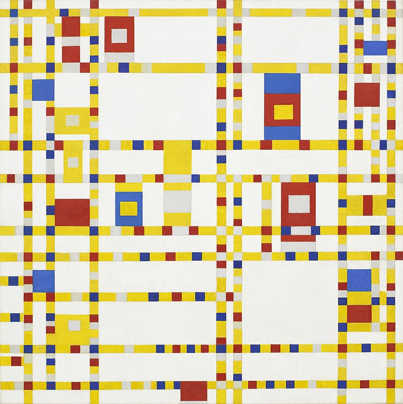
The title of this painting reflects an intention, a movement. Broadway Boogie Woogie was made by Mondrian in New York in 1942. One might say that the artist was crazy about jazz. Indeed, the horizontal and vertical lines transport us to a dance floor. We can feel the music and the dancers’ movements. Also, the rectangles and squares in yellow, red, blue, white, and gray make us navigate through the streets of New York City, through the traffic lights and the taxis.
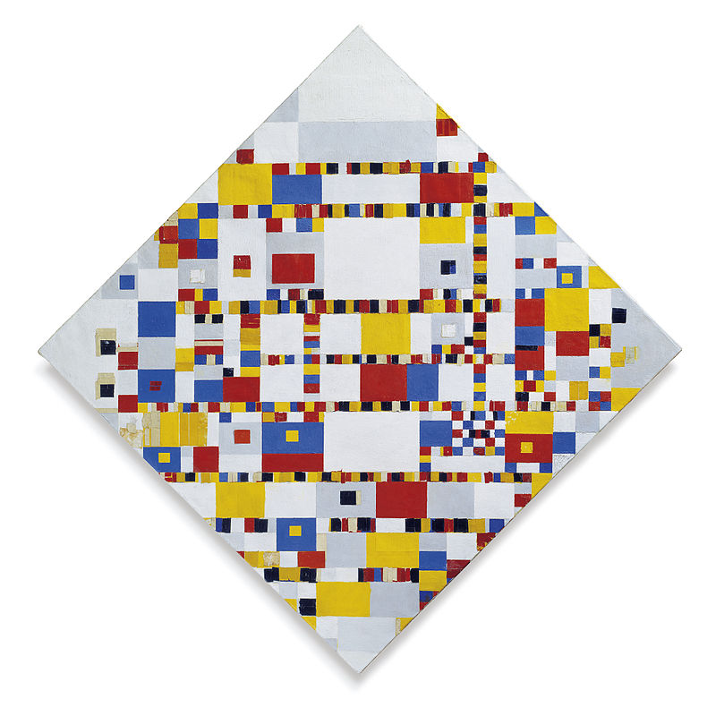
I would like to finish with the final and also an unfinished work by Mondrian. It was mentioned that Mondrian never used diagonal lines, but he did turn his canvas! What happened with the lines here? In comparison with Broadway Boogie Woogie, where the lines become planes, here everything is a plane. Multiplicity predominates in the composition and our eyes can’t stop moving from one color to another.
DailyArt Magazine needs your support. Every contribution, however big or small, is very valuable for our future. Thanks to it, we will be able to sustain and grow the Magazine. Thank you for your help!

Cèlia Leiva Otto holds a bachelor’s degree in Art History and a master’s degree in Aesthetic Research from EINA University School of Design and Art in Barcelona. She works as a curator, cultural communicator and art educator, collaborating with institutions and creative projects across Spain. Her current practice focuses on building bridges between art and community through exhibitions, workshops and collective initiatives such as Diumengem, a women-led platform that reimagines exhibition. She also contributes to DailyArt Magazine, writing about artists, exhibitions, and visual culture.
Icons are among the oldest image traditions, yet they often remain misunderstood, especially in the West. They belong to a visual culture that...
Catherine Razafindralambo 27 April 2026
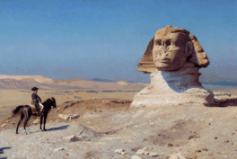
As one of the most enduring symbols in world mythology, the sphinx embodies a fascination with mystery, power, and transformation. From its origins...
Martha Teverson 10 November 2025
Color theory has played a central role in art throughout history, shaping how viewers respond to images even before they consciously think about the...
Jimena Aullet 12 January 2026
The Northern Renaissance took place in Europe north of the Alps, primarily in regions like the Netherlands, Germany, France, and England. Artists...
Anna Ingram 31 March 2025