According to research as recent as 2015, claims that red light can speed up the heart rate while blue light can lower it; have been proven true. This fact was of such significance that, based on previous claims, Tokyo’s Yamanote Railway installed blue lights at the ends of its platforms to reduce suicide attempts. It worked, lowering them by 74%. But while this astounding realization may now have science on its side, it had already been practiced in art for centuries.
The use of color has always been part of the artist’s toolbox, as demonstrated by artists such as Mark Rothko. In 1958, the American abstract painter explained during a lecture at the Pratt Institute, as he himself put it, that figures could no longer serve his purpose. He felt he mutilated them, and so he was forced to find an alternate means of expression.
When Figures Are Not Enough
As stated by Professor Memory Holloway, in the National Gallery of Victoria Art Journal 23:
Opposite Reactions
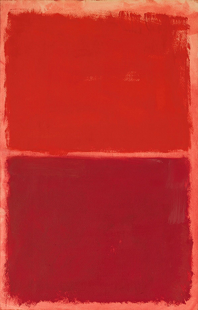
According to color psychology, red recalls strong reactions through its vibrant and intense characteristics. This can lead to it being used to depict emotions such as affection and love, as well as rage and aggression. Not coincidentally, the color of blood, which tends to pump faster and makes us blush during these emotions, is also usually depicted as red.
Blue, on the other side of the spectrum and as stated before, represents calmer, more tranquil emotions. It helps slow our heartbeats down, allowing us to make calmer decisions, but its cold tones can also be associated with sadness and nostalgia.
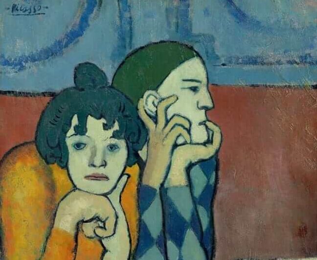
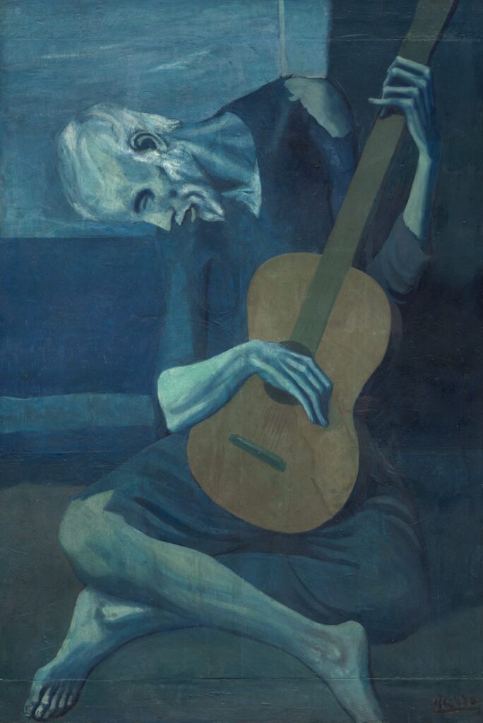
Often regarded as Picasso’s most representative piece of his Blue period, The Old Guitarist, a mostly monochromatic piece depicting a solitary street musician, brings about feelings of isolation and struggle. Even the warm hues of the guitar are not enough to overcome the angst produced by the blue tones making up the figure.
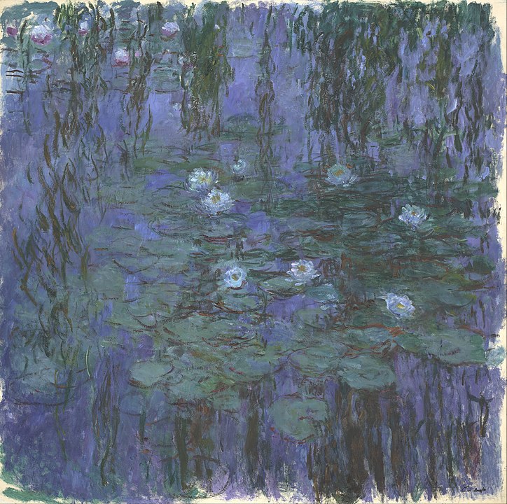
But blue isn’t necessarily sad. Tranquility and calmer feelings can be expressed by blueish hues, as expertly achieved by Monet, in some of his acclaimed water lilies.
Nature vs Culture?
Still, the question lingers: why is this so? Why do some colors recall certain emotions? And if these emotions are contradictory, what determines which one is recalled? According to Doctor Nafissa Ismail, Associate Professor of Psychology at Ottawa’s Faculty of Social Sciences, there are two sources that shape our relations to colors. The first is our natural instinct. As she explained during a Q&A in Quirks & Quarks TV show, babies can’t see very well, so dull colors don’t get a major response, while bright and vibrant ones attract their attention better, making them happier. As they grow, the colors they see in their environment give meaning to the relationship they have with them, which is why red is often used as a warning color. But as cultural experiences become more prominent, these associations can again vary.
So red, which as established, can be used to show danger, can become a color linked to romance (flowers, hearts, St. Valentine’s decorations). These symbols vary from culture to culture, which makes the use of colors in art an interesting space for cultural exchange.
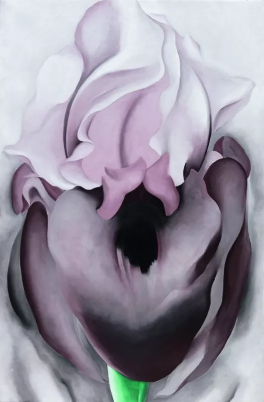
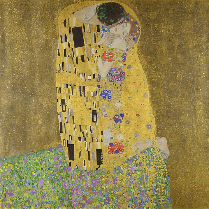
Purple can represent wisdom, creativity, sensuality, and wealth, which is most likely due to its historical relationship with royalty. This may have come from the ancient Greeks who discovered how to dye fabric this color albeit through a very expensive and taxing process. It is also said part of its mystique is due to the fact that it lies in the balance between red and blue, making it a mix of a calm color and a more vibrant one. While still associated with royalty in African countries, it has religious meanings for Catholicism and Judaism, while symbolizing peace and wisdom among Hinduists, and honor in the United States.
More Examples
In Western society, green, the color of plants and nature, can mean wealth, luck, and prosperity.
Yellow can bring a cheerful feeling to a painting, but it can also be the cause of saturation, creating an overwhelming and overstimulated sensation.
And orange, a color often seen in depictions of fire or sunset, is abundant in energy and will easily draw attention to itself.