Summary
- Venetian painters relied on specialized color merchants (vendecolori), whose shops reveal how commerce shaped the city’s extraordinary palette.
- Made from lapis lazuli imported from Afghanistan, ultramarine was one of the most expensive pigments in Venetian painting, symbolizing both artistic brilliance and the city’s global trade connections.
- Introduced from the Americas in the 16th century, cochineal lake brought an intense red hue to Venetian paintings, reflecting the luxury of dyed textiles.
- Made from a toxic arsenic mineral, orpiment produced brilliant yellow, orange, and gold-like hues, prized by artists for their luxurious and dramatic effects.
- A humble but essential pigment, green earth was used beneath brighter colors to build depth and naturalism, helping artists create the subtle foundations of Venetian painting.
- Venetian color was shaped by trade and craftsmanship, with pigments transforming the city’s global connections into artistic brilliance.
Where Venetian Painters Bought Their Colors
The material story of Venetian color begins with the city itself. Its artists did not work with color in the abstract. They worked with minerals, insects, earths, metals, resins, and dyes; many of them were carried into the city through Venice’s powerful trade networks. A Venetian painter’s palette was therefore not only an artistic tool, but also a record of commerce.
In many Italian cities, painters bought pigments and other workshop materials from apothecaries, whose shops sold a wide range of substances for medicine, craft, and domestic use. Venice was different. There, artists could turn to the vendecolori, specialized color sellers who dealt in materials for painting and related trades. They are documented in Venice from at least the 1490s, earlier than similar specialists are usually found elsewhere in Europe. Their presence suggests how strong the demand for color had become in the city, both among painters and among the many other artisans who depended on pigments and dyes.
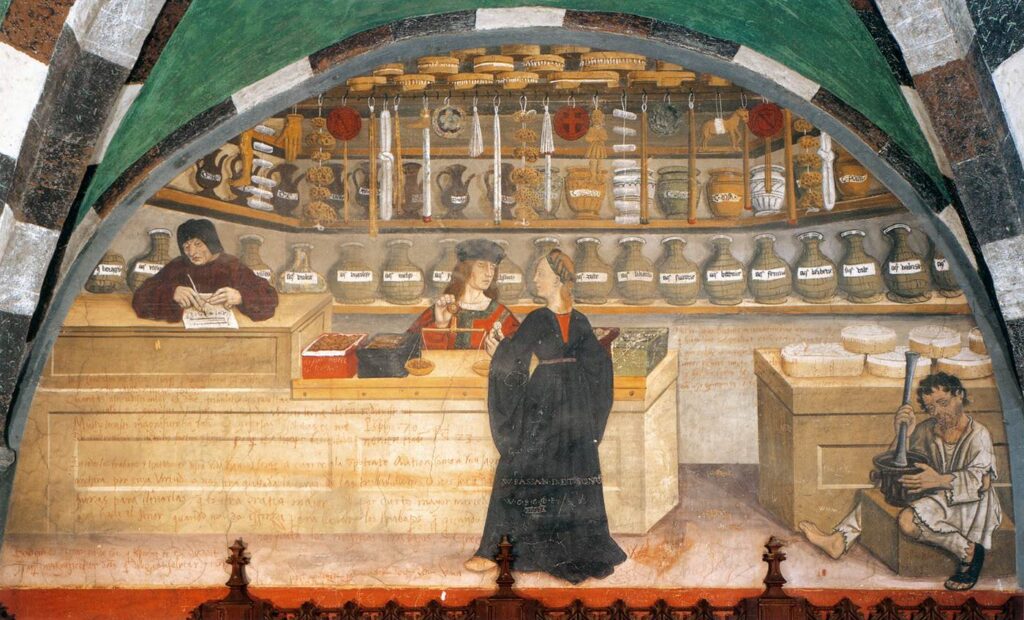
Apothecary’s Shop, 1489–1502, Issogne Castle, Issogne, Italy. Web Gallery of Art.
One remarkable document shows just how varied this world of color could be. A 1534 inventory from the shop of Ser Domenico, son of Ser Gabriele of Gardignano, lists 102 substances and objects, many with their weights and quantities recorded. The list includes materials familiar from Venetian painting: verdigris, smalt, German blue, red and black earths, bone black, lead white, red lakes, realgar, orpiment, and others.
A small but vivid clue appears in Titian’s Portrait of a Man with a Palm, where a painter’s color box (in the lower left corner of the background) reminds us that Renaissance color was a material thing before it became a visual effect. Behind every blue robe, red sleeve, yellow highlight, or green shadow stood a chain of mining, trade, preparation, and sale. This article looks at four pigments that help open that box: ultramarine, cochineal lake, orpiment, and green earth.
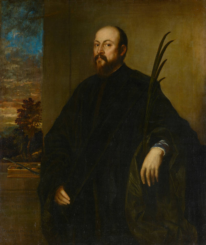
Titian, Portrait of a Man with a Palm, 1561–1562, Gemäldegalerie Alte Meister, Dresden, Germany. Museum’s website.
Ultramarine—Expensive Blue from Beyond the Sea
Of all the colors in a Venetian painter’s box, ultramarine carried the strongest sense of distance. Its name comes from the Latin ultramarinus, meaning “beyond the sea,” a reminder that this blue reached Europe through long trade routes. The mineral behind it was lapis lazuli, especially from Badakhshan, in present-day Afghanistan, whose mines were famous in medieval travel writing. Marco Polo described the blue stone found there as among the finest in the world.

Giovanni Bellini, Madonna of the Meadow, c. 1500–1505, National Gallery, London, UK. Museum’s Website.
Before lapis lazuli became the luminous blue of a Virgin’s mantle or the clear color of a sacred sky, it had to travel. The stone moved from the mountains of Central Asia through river valleys and Silk Road cities, then toward Persia, Constantinople, the Black Sea, and Mediterranean ports. Venice, with its commercial ties to the eastern Mediterranean, became one of the great European markets for this costly material.
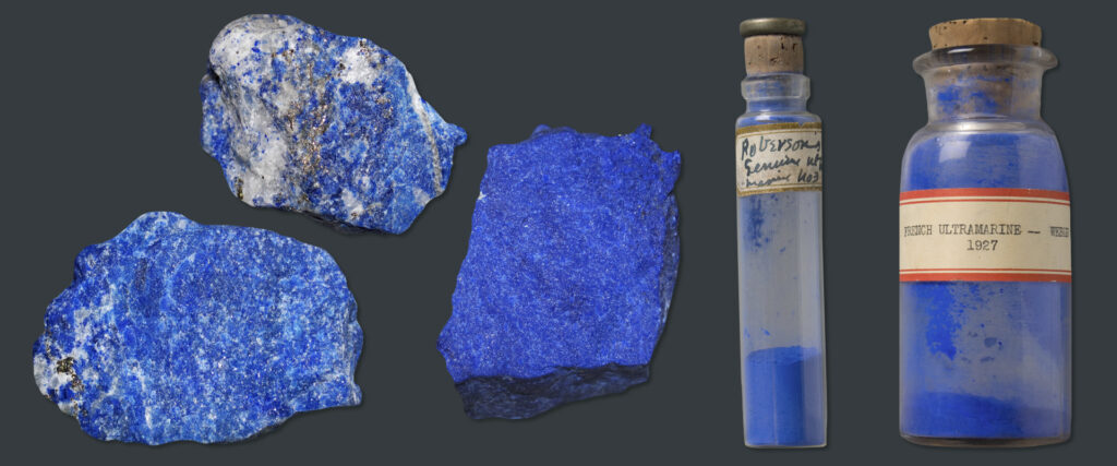
Pieces of lapis lazuli and ultramarine pigment samples. Fine Art Restoration Company.
The expense did not end with transport. Lapis lazuli had to be carefully processed before it could become true ultramarine. Only a small portion of the stone produced the intense blue pigment, which helped make genuine ultramarine one of the most expensive colors available to painters. In contracts and workshop practice, ultramarine often signaled devotion, wealth, and prestige. A patron who paid for ultramarine was paying for more than blue. They were paying for rarity.
That is why the blue in Venetian painting can feel so charged. In Giovanni Bellini’s Madonna of the Meadow and Titian’s Madonna of the Rabbit, ultramarine does more than fill a robe or brighten a sacred image. It carries the material history of a stone mined far from Italy, refined through difficult craft, and sold through the same commercial world that helped make Venice rich.

Titian, Madonna of the Rabbit, c. 1530, Louvre, Paris, France.
Cochineal Lake—Red from the New World
If ultramarine brought the distance of Central Asia into Venetian painting, cochineal lake brought the intensity of the “New World.” Venice was famous for rich reds: glowing sleeves, crimson robes, velvet draperies, and fabrics that seemed to absorb and reflect light at the same time. Some of these reds came from older European and Mediterranean sources, such as madder and kermes. In the 16th century, however, American cochineal added another powerful red to the painter’s and dyer’s world.
Cochineal comes from tiny scale insects that live on cactus plants. When dried and processed, their bodies produce a brilliant red dye. Long before Europeans encountered it, cochineal was used in the Americas for textiles and other colored objects. After the Spanish conquest of the Aztec Empire, cochineal began to travel across the Atlantic. The first shipments reached Spain in the 1520s, and over time, the dye became one of the most valuable materials carried from the Americas to Europe.
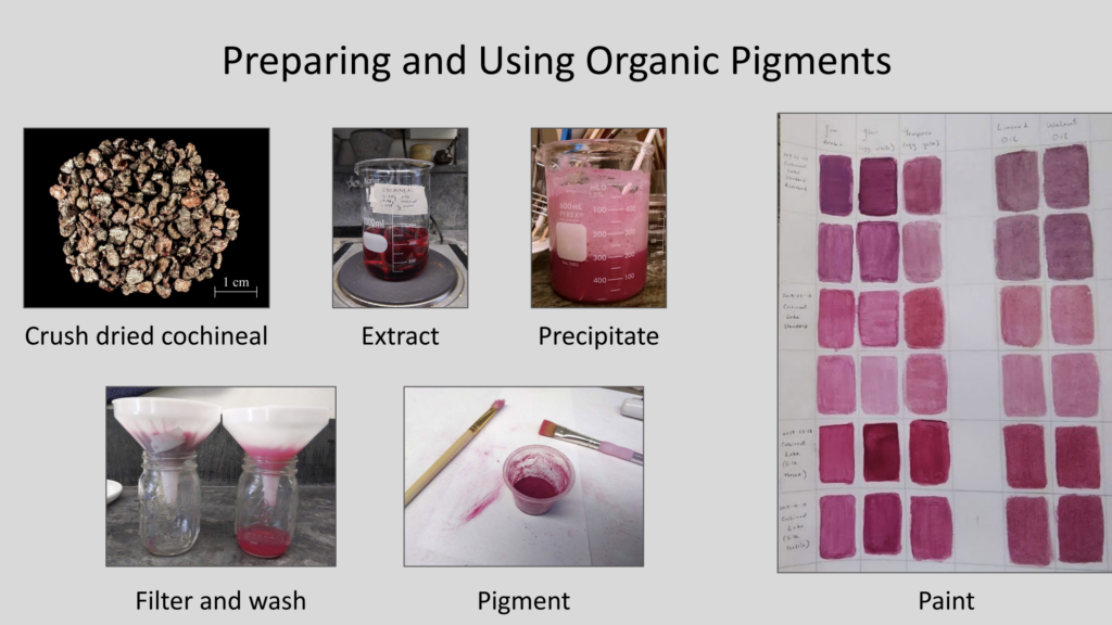
Reconstruction of cochineal lake pigment production. Sandbox.
Its appeal was easy to understand. Cochineal produced a vivid, luxurious red that worked especially well on fine textiles such as silk, satin, and velvet. It became associated with wealth, rank, and display—the same world of cardinals, nobles, merchants, and courtesans that Venetian painters so often represented. For artists, cochineal could be transformed into a lake pigment, allowing the brilliance of dyed cloth to enter the painting itself.

Jacopo Tintoretto, Portrait of Vincenzo Morosini, c. 1575–1580, National Gallery, London, UK. Museum’s website.
In Tintoretto’s Portrait of Vincenzo Morosini, the red costume does more than describe fashion. It announces status through color. In Miracle of the Slave, red also becomes part of the painting’s drama, pulling the viewer’s eye through the crowded scene. Cochineal lake reminds us that Venetian color was never only local. Even the red of a sleeve or robe could carry the history of conquest, trade, luxury, and desire.

Jacopo Tintoretto, Miracle of the Slave, 1547-48, Gallerie dell’Accademia, Venice, Italy. Museum’s website.
Orpiment—A Dangerous Yellow
Orpiment brought a different kind of brilliance to the Venetian palette. Its Latin name, auripigmentum, means “gold pigment,” and the name makes sense at first sight. The mineral can produce a sharp, glowing yellow that seems close to gold itself. Ancient writers such as Pliny and Vitruvius knew it, and its history reaches across Egyptian, Persian, Greek, and Asian sources. Even its older names carry the idea of gold.
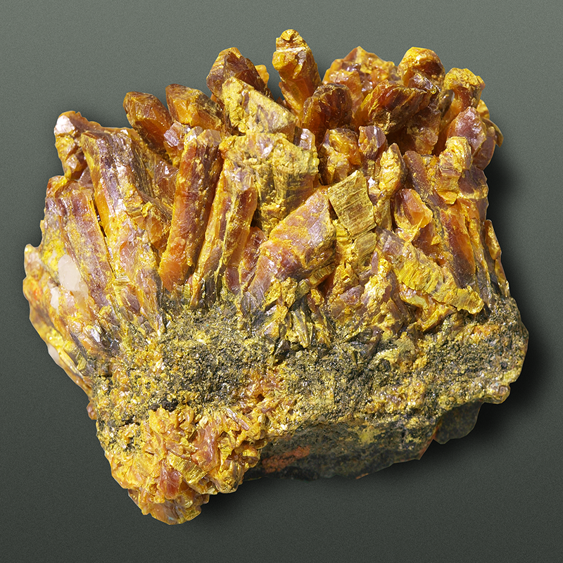
Orpiment. Master Pigments.
That beauty came with danger. Orpiment is an arsenic sulfide, a rare mineral often found with realgar, its orange-red relative. Together, the two minerals could create the rich yellow and orange passages that became especially striking in Venetian painting around the end of the 15th century. Earlier Italian painters used these arsenic pigments more cautiously, but Venetian artists seem to have embraced their brilliance with unusual confidence.

Titian, The Holy Family with a Shepherd, c. 1510, National Gallery, London, UK. Museum’s website.
This helps explain the intense yellow-orange effects found in the work of painters such as Veronese and Titian. Orpiment was especially useful when artists wanted a color that felt warm, artificial, luxurious, and almost metallic. It could catch the eye like embroidery, flame, or reflected light. In Tintoretto’s paintings, these yellows and oranges often heighten movement and drama, giving fabric and ornament a vivid physical presence.
Orpiment reminds us that Venetian color was sometimes built from unstable choices. Painters were not simply choosing “yellow.” They were choosing a costly, difficult, and toxic material because its visual effect was powerful. In that sense, orpiment belongs perfectly inside the Venetian color box: beautiful, risky, and impossible to ignore.

Green Earth—The Quiet Color Beneath the Skin
After ultramarine, cochineal, and orpiment, green earth may sound modest. It was not as rare as lapis lazuli, as luxurious as cochineal, or as dangerous as orpiment. Yet it belonged deeply to the painter’s craft. Made from naturally occurring clay minerals such as celadonite and glauconite, green earth was one of the oldest pigments known to artists. It appeared in ancient wall paintings, including examples from Pompeii, and remained useful for centuries.
One of its most famous historical sources was near Verona. In the 16th century, Michele Mercati described green earth from the area of Monte Baldo, a mountain range between Verona and Trento. For Venetian painters, this meant that not every important color had to arrive from across the sea. Some colors came from much closer ground.
Green earth rarely has the force of brighter greens such as verdigris or malachite. Its power lies in restraint. During the Middle Ages and the Renaissance, artists often used it in underpainting, especially for flesh tones. Beneath pink skin, brown shadow, or a modeled face, a cool green layer could help build depth and softness. It gave the body structure before warmer colors brought it to life.
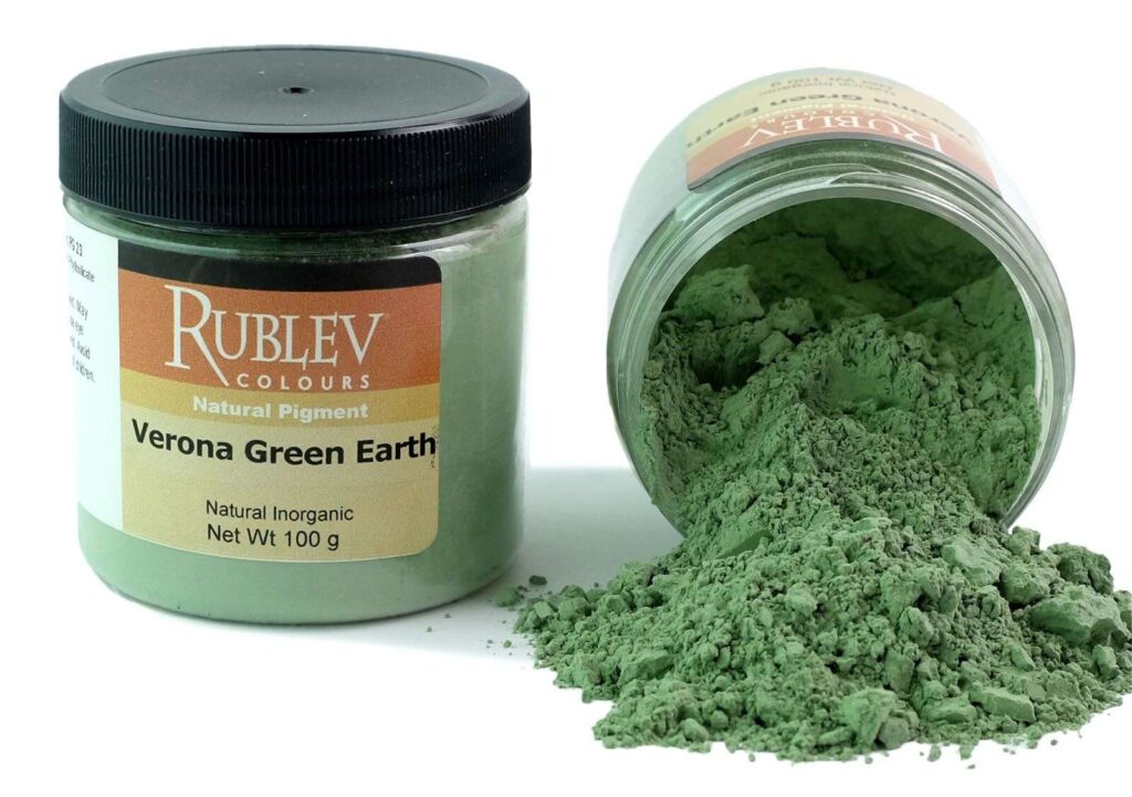
Verona green earth pigment. Natural Pigments.
Titian’s Bacchus and Ariadne offers a beautiful example of this quiet work. Technical analysis has identified green earth in the underpaint layer of the bright foliage to the left of Bacchus, where it was mixed with lead white, and in the greenish shadows of Bacchus’s left forearm. These are not the kinds of passages that announce themselves like ultramarine blue or cochineal red. They work from within the painting, helping Titian build flesh, vegetation, and shadow through layered color.
This makes green earth a very different kind of pigment from the others in the Venetian color box. It was not a color of display but a color of construction. In a painting, it might not be the first thing a viewer notices. Yet without such quiet materials, the more brilliant colors around it would have less body, less shadow, and less life.

Titian, Bacchus and Ariadne, 1520–15223, National Gallery, London, UK. Museum’s website.
Beyond the Color Box
By the end of the 15th century, Venetian painters had access to an unusually rich range of colors. That richness did not come from style alone. It came from Venice’s position as a maritime trading center, from the movement of goods across long distances, and from the specialized work of the vendecolori, who supplied painters with materials from near and far.
The four pigments discussed here show how wide that world could be. Ultramarine carried the distance of Central Asia into the blue of sacred robes. Cochineal lake brought the intensity of the Americas into the reds of luxury clothing and painted drama. Orpiment offered a brilliant, risky yellow rooted in ancient mineral knowledge and Italian sources. Green earth, quieter than the others, helped build flesh, foliage, and shadow from beneath the surface.
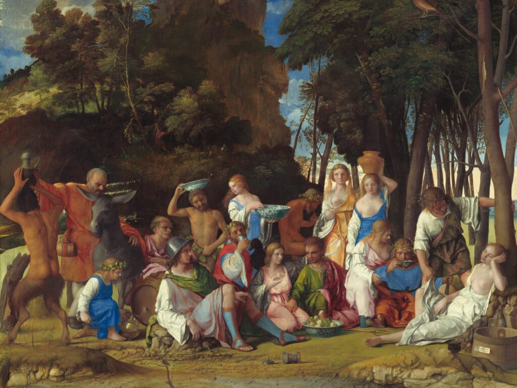
The Feast of the Gods, 1514-1529, Giovanni Bellini and Titian, National Gallery of Art, Washington, D.C., United States. Museum’s website.
Together, these pigments remind us that Venetian color was never only a matter of taste. It was material, commercial, and global. Every painted blue, red, yellow, or green depended on miners, merchants, color sellers, workshop assistants, and artists who knew how to turn raw substances into visual power.
The vendecolori also served more than painters. Their shops supplied many Venetian artisans who worked with color, including glass painters, potters, sculptors, decorators, and makers of painted interiors or terrazzo floors. In this sense, a color seller’s shop was more than a place to buy pigment. It was part of a larger exchange of materials, skills, and visual ideas across the city.
To look into a Venetian painter’s color box, then, is to see more than beautiful materials. It is to see Venice itself: a city where trade, craft, and artistic imagination met in color. The brilliance of Venetian painting was not simply applied to the canvas. It arrived there through the world.