A Beginner’s Guide to Icons in Eastern Christianity
Icons are among the oldest image traditions, yet they often remain misunderstood, especially in the West. They belong to a visual culture that...
Catherine Razafindralambo 27 April 2026
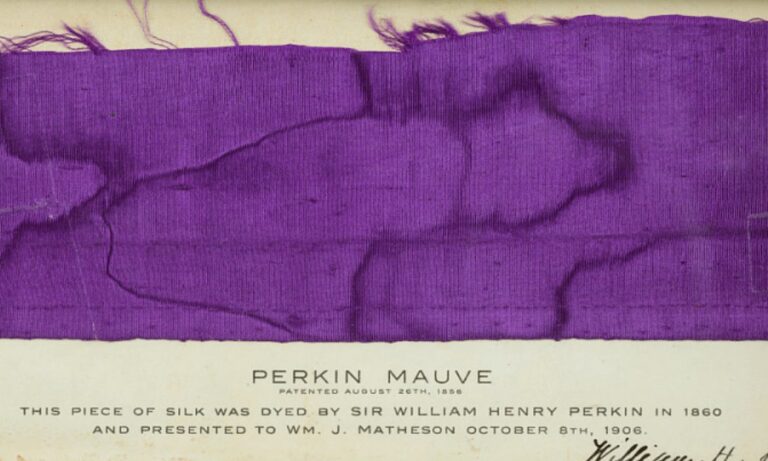
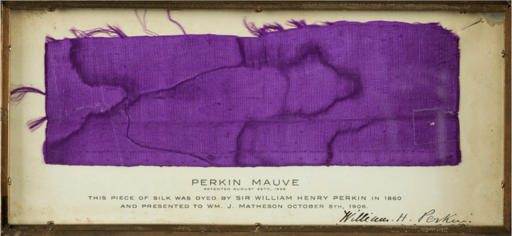
Sir William Henry Perkin, Perkin Mauve, 1860, National Museum of American History, Washington, DC, USA. Detail.
Every person probably dreams of leaving a legacy to the world. For artists this is a central goal and they try to do it through their masterpieces of course. Some people even went further though… They gave their name to a hue! Iconic artists used colors which inherited their names. However, in the field of science particular shades also have the name of the person who found them or of an important personality. Finally, some hues have a proper name just because a particular person loved and used them. Let’s see the famous art history colors!
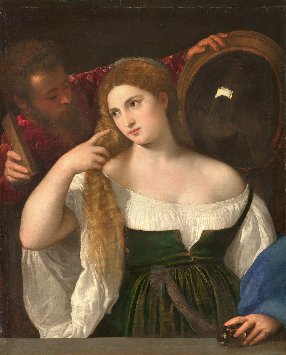
Titian (Tiziano Vecellio) was a great 16th century Venetian painter. He is known for his exquisite technique displaying all of the canons of late Renaissance beauty, and for his love for the color red. He often gave red details to characters in his paintings, from their dresses to their hair, in an incredible range of shades.
Actually, the very well-known “Titian Red” is not the general name for all of these shades but for one in particular: the hair color. Titian invariably used to paint gentle, beautiful characters with unmistakable copper-blonde hair, a warm red-orange tint. It soon became synonymous with sensuality and female elegance. This shade had an incredibly broad success. Even noble ladies looked for hair dyes that could reproduce it!
Paolo Caliari, known more as Paolo Veronese, was another Italian painter, born in Verona (which is where the name Veronese comes from) who moved to Venice in the 1550s.
The story of the art history color with this name is extremely interesting. First of all, “Veronese Green” probably was first used as a color name in the English language during the 19th century. Secondly, “Veronese Green” was actually a technique, not a specific color. In other words, not only Veronese, but many artists used a series of layers of pigments and metals (especially copper) to create certain shades of green. Moreover, Caliari did not have a special preference for the color green. He would rather search for complementary color harmony using all the available pigments in Venice. Green was very present as a contrast to red anyway, and the shades of Veronese were incredibly bright.
After these considerations, we can understand the history of this color – and of its name. Through the centuries the original color probably changed a little because old pigments were based on unstable metals, egg yolks, and oil. Most likely it was especially associated with Veronese because all Venetian artists learned to use bluish greens, but Caliari more often applied it to balance out red. At the same time the great painter’s fame grew. As a result, in the 18th century the chemical industry of the color began producing hues in a different way. Voluntarily or not, a particular tone of green was called “Veronese Green” because it imprecisely recalled the shade in his famous works. He did not actually invent or discover the color though, and it was not the original one used. However, the name remains a great celebration of Caliari!

Anthony van Dyck was a Flemish painter of the 17th century. After being a pupil of Peter Paul Rubens, he became the official painter to the court of King Charles I of England and Scotland. He also traveled a lot, especially spending time in Italy.
His name is linked to “Vandyke Brown”, a warm brownish-grey whose exact nature is still a matter of debate. Many authors and researchers found that he might have mixed in actual dirt! Others believe this shade is related to the ancient Cassel Earth pigment. That name comes from the former name of the German city of Kassel, where they originally extracted it. It was actually an organic material, consisting of young coal.
Whichever the origin, van Dyck masterfully used this hue to create a transparent, warm color, suitable for glazes. Through this color, he managed to create his unique way of reproducing shadows and elevating light points. He found a different solution to the same goal of Caravaggio.
Yves Klein was an artist with a special interest in the meanings within and underlying art. He proposed an evolution of art toward immateriality and abstraction, progressively abandoning physical objects.
In this scope, he was one of the artists who was most dedicated to the theme of color. Klein looked for pure pigments, without glues, to preserve their brightness. His interest in colors and his use of them was an actual philosophical process, leading him to search for the color’s essence. But that was not enough; Klein wanted to really create color.
Although initially he used many shades, he was really obsessed with blue. Therefore, in 1956 he found a unique intense ultramarine, synthesis of sky and earth: “International Klein Blue” – IKB. It relied on ultramarine pigment mixed with a synthetic resin that wouldn’t dilute its color.
The artist developed it in collaboration with chemical experts and the owner of the famous paint factory Adam (in Montparnasse, Paris). IKB was never industrially produced. It “just” remained the unmistakable central subject of Klein’s oeuvre – both paintings and performances. Especially his monochromes in this brilliant ultramarine are meant to suggest the infinity of sea and sky. Klein himself once said, “Blue has no dimensions, it is beyond dimensions.” In 1960, Yves Klein trademarked his color, registering a formula for it with the French government. That’s a great legacy to the world! New art history color.
Leonhart Fuchs was a 16th century German botanist, one of the fathers of the modern botany. One of his successors, Charles Plumier, honored him by naming a genre of plants Fuchsia. Actually, Fuchs had never really known them. These plants bloomed with beautiful colored flowers, mostly in a vivid red-purple… “Fuchsia!”
Similar to this was the origin of the name “Hooker’s Green”, another art history color. Sir William Hooker was a British botanical illustrator who became the official artist of the Royal Horticultural Society. He needed a specific green color to perfectly reproduce the shade of leaves, so he created it! He mixed Prussian blue and gamboge to obtain the right hue he was looking for.
The story of art history color “Perkin’s Mauve” included plants and flowers too, but in a totally accidental way. During the 1850s chemistry student, William Henry Perkin, was trying an innovative method to synthesize quinine, an active ingredient used to treat malaria. His experiment did not work correctly but after the process he obtained some purplish sludge. Perkin himself patented that particular color with his name. Also known as aniline purple or mauveine, it was one of the first synthetic dyes ever created, and among the first to have been mass-produced. In 1859, it received the name mauve in English borrowing the French name for the mallow flower.
In 1775 the Swedish chemist Carl Wilhelm Scheele discovered that arsenic could make a bright green. Therefore, “Scheele’s Green” was just the right name for this metal-based pigment.
Some colors named after people just reflect their lifestyle and their love for a specific tone in their everyday life. For some reason, the most beloved (and renamed) color through the years has been blue.
President Theodor Roosevelt’s daughter, Alice, had a real passion for blue. It was so easy to rename her favorite ice-blue tint “Alice Blue.”
Pantone decided to honor the designer Richard Nicoll some months after his death by collaborating with his family and friends to create and standardize another blue: “Nicoll Blue.”
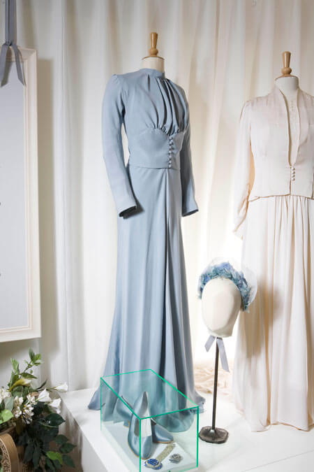
Wallis Simpson was a woman who loved Edward VIII and whom he abdicated the British crown for in 1936. She was a lover of blue too. When they married, she wore a wedding dress with a very singular hue: a light blue with a grey undertone. It could be nothing but “Wallis Blue.”
Ball, Philip, Bright Earth: The Invention of Colour, Vintage Books USA, 2008.
DailyArt Magazine needs your support. Every contribution, however big or small, is very valuable for our future. Thanks to it, we will be able to sustain and grow the Magazine. Thank you for your help!

Neurosurgery resident in Italy, who especially loves paintings and the relationship between Art and Medicine. Football addicted, lover of cats, mother of dragons (...that's not true, but I wish it was)
Icons are among the oldest image traditions, yet they often remain misunderstood, especially in the West. They belong to a visual culture that...
Catherine Razafindralambo 27 April 2026
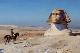
As one of the most enduring symbols in world mythology, the sphinx embodies a fascination with mystery, power, and transformation. From its origins...
Martha Teverson 10 November 2025
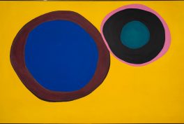
Color theory has played a central role in art throughout history, shaping how viewers respond to images even before they consciously think about the...
Jimena Aullet 12 January 2026
The Northern Renaissance took place in Europe north of the Alps, primarily in regions like the Netherlands, Germany, France, and England. Artists...
Anna Ingram 31 March 2025