
The Paint Colors That Killed Artists—And the Women Who Wore Them
Did you know that some of the most admired painters’ pigments in art history are also among the most toxic? The pursuit of beauty has sometimes...
Celia Leiva Otto 4 June 2026
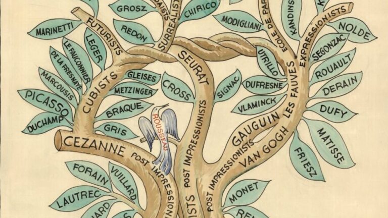
Miguel Covarrubias, The Tree of Modern Art—Planted 60 Years Ago, 1933 (this printing 1940), David Rumsey Map Collection, Stanford University Libraries, Stanford, CA, USA. Detail.
Art history is a field that explains pictures using words. A few people have tried the opposite. Some sketch the landscape of art by hand, shaped by personal taste or a healthy dose of satire; others take a science-based approach and let the data decide by mapping the connections between artists and styles. Let’s take a closer look at five art history diagrams that attempted to organize the movements and trends in art.
The most famous of the art history diagrams is probably Alfred H. Barr’s 1936 chart of modern art, created for the Cubism and Abstract Art exhibition at MoMA, which focused on the development of art between the 1890s and the 1930s. Two of its descendants appear below. Each piece on our list offers a fresh perspective on art movements and puts individual works into context. Whether you come to learn or simply to look, this collection is for you.
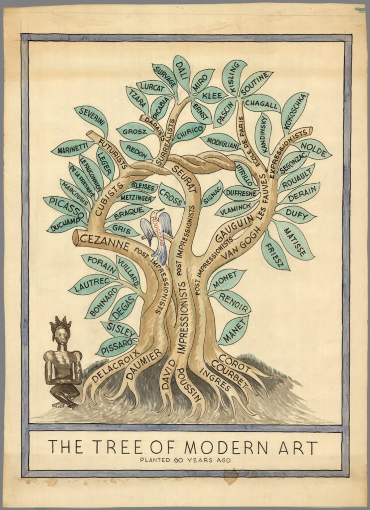
Miguel Covarrubias, The Tree of Modern Art—Planted 60 Years Ago, 1933 (this printing 1940), David Rumsey Map Collection, Stanford University Libraries, Stanford, CA, USA.
Miguel Covarrubias’ (Mexican, 1904–1957) work drawn in 1933 captures a pivotal moment in art history, illustrating the interconnectedness of various artistic movements that defined the modern era. By then, the world had witnessed dramatic shifts in artistic expression, moving away from classical forms to embrace abstraction and experimentation.
The tree is rooted in late Classicism and Romanticism and branches out into various early-20th-century art movements, including Surrealism and abstract art. This work serves both as a celebration of artistic innovation and as a visual approximation of the lineage of modern art in a slightly whimsical and playful way.
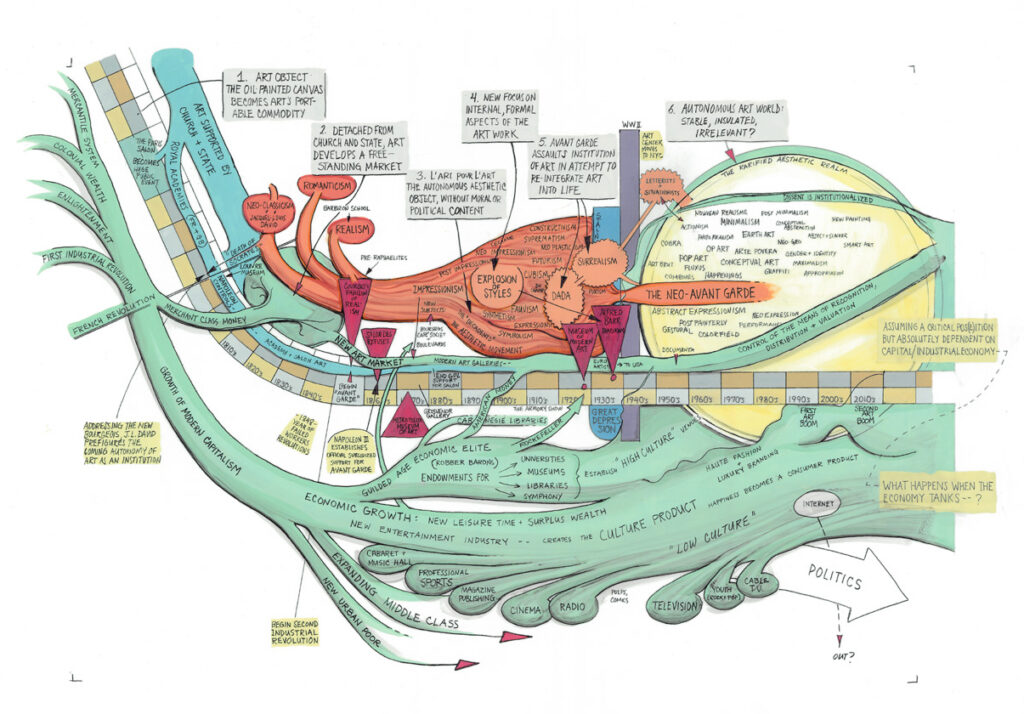
Ward Shelley, Autonomous Art, Ver. 1, 2007–2009. Pierogi Gallery
This piece maps the history of artistic “autonomy” and movements in the context of shifting economic pressures and funding sources. The top half pictures art movements from the 17th century to the modern era, while the bottom half contrasts key economic developments, funding sources, and key technical developments that shaped markets and consumer behavior. Both parts are interwoven through organic shapes, highlighting their natural and inevitable interactions.
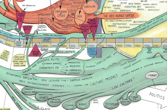
Ward Shelley, Autonomous Art, Ver. 1, 2007–2009. Pierogi Gallery Detail.
Ward Shelley’s (American, b. 1950) various timeline pieces are expansive graphic depictions of complex relationships between events and people over time, linked by a subject or idea. Driven by their content, Shelley’s drawings are rich in factual detail, yet often present highly subjective points of view.
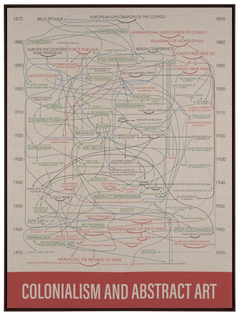
Hank Willis Thomas, Colonialism and Abstract Art, 2019, National Gallery of Victoria, Melbourne, Australia.
Colonialism and Abstract Art is an extension of the best-known depiction of modern art’s development, Barr’s chart. Unlike the original diagram, it expands to include the socioeconomic, cultural, and political circumstances that inform the most iconic movements in modern art. The diagram highlights individual pieces central to artistic development, including Pablo Picasso’s Les Demoiselles d’Avignon (1907) and Henri Rousseau’s The Dream (1910).
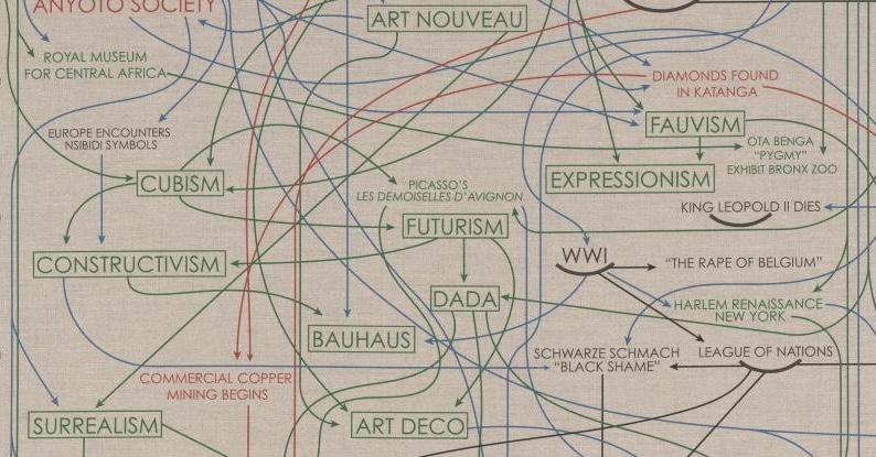
Hank Willis Thomas, Colonialism and Abstract Art, 2019, National Gallery of Victoria, Melbourne, Australia. Detail.
Hank Willis Thomas (American, b. 1976) intertwines art and history between 1870 and 1970, beginning with the European exploration and colonization of the Congo and concluding with the decade of its independence a century later. In the diagram, red text is related to Africa, green text denotes cultural movements, and blue arrows suggest connections across categories.
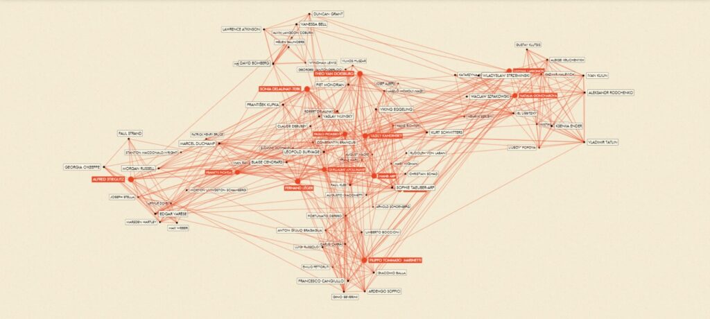
Paul Ingram and Mitali Banerjee, network diagram for Inventing Abstraction, 1910–1925, 2012, Museum of Modern Art, New York City, NY, USA. DAHD.
Great ideas are seldom born in isolation—and abstraction is possibly the greatest idea in modern art. Today, abstraction is so central to artmaking that the time when an abstract artwork was unimaginable has become hard to imagine. Yet when those works first appeared—quite suddenly, around 100 years ago—they took many observers by surprise.
The diagram created for MoMA’s 2012 exhibition Inventing Abstraction, 1910–1925 examines the productive relationships among fine artists and other genres—including composers, dancers, and poets. It brings together a wide range of art forms to draw a rich portrait of this watershed moment in which art was wholly reinvented in the period between 1910 and 1925. Wassily Kandinsky sits on more paths between other artists than anyone else—by the network’s own measure, the most connected figure in the invention of abstraction.
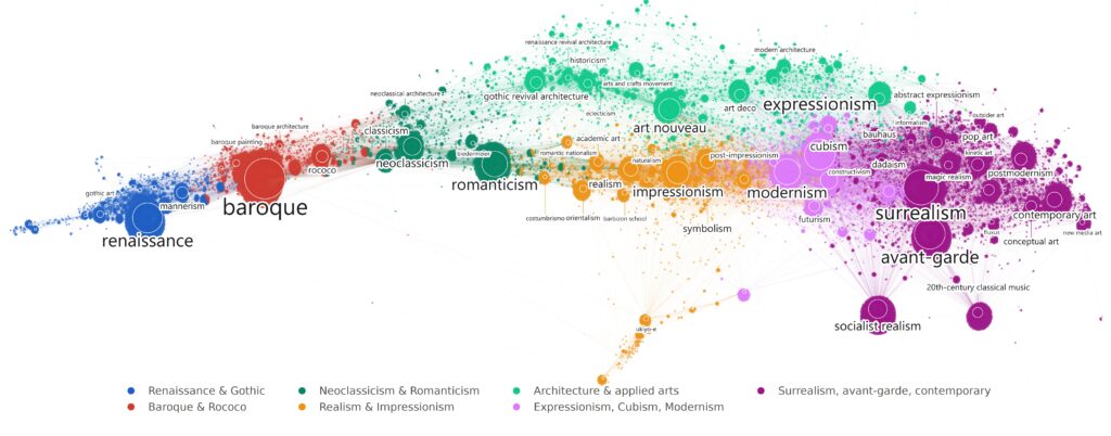
Doron Goldfarb, Uncovering and Comparing Large-Scale Art History Narratives in Biographical Datasets, 2020, dissertation, TU Wien, Vienna, Austria. Data and layout by the author; color rendering by Oliver Hausdörfer.
Another descendant of the famous Barr diagram. Doron Goldfarb and his colleagues asked what a diagram of art history would look like if it were drawn by everyone. They took Wikipedia’s articles on artists and on art styles and let the hyperlinks do the arranging: every small dot is a person, every large circle an art movement, and every line a link between the two.
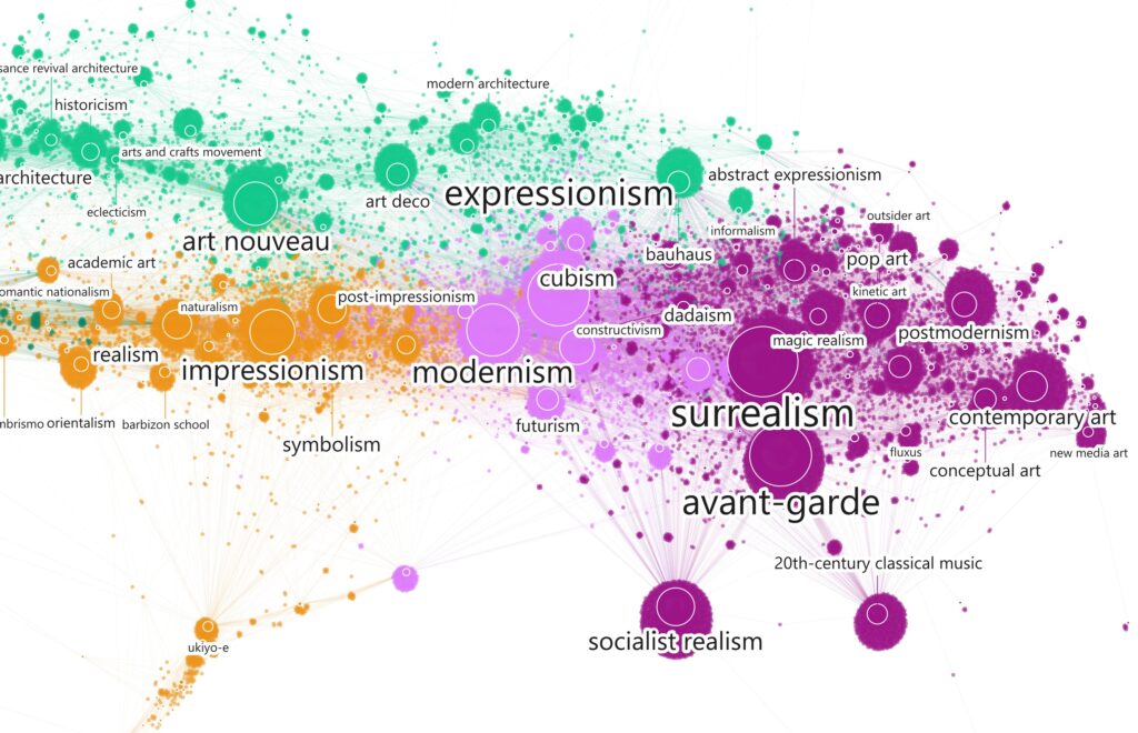
Doron Goldfarb, Prunned network of persons and art and architecture styles, in: Doron Goldfarb, Uncovering and Comparing Large-Scale Art History Narratives in Biographical Datasets, 2020, dissertation, TU Wien, Vienna, Austria. Data and layout by Doron Goldfarb; color rendering by Oliver Hausdörfer. Detail.
Where Barr drew a couple of dozen art movements, this map holds 375, and the 55,000 people Wikipedia attaches to them—art history at a scale no single scholar could survey, from the Renaissance and Baroque at the left to the avant-garde and contemporary art at the right. The size of the cluster represents the number of people who made it. Nobody decided this shape—it is what collective attention looks like when you plot it.
Author’s bio:
Oliver Hausdörfer is a robotics researcher working on intuitive human-robot interfaces and learning-based methods. He is enthusiastic about art and using technology to explore new forms of artistic expression.
DailyArt Magazine needs your support. Every contribution, however big or small, is very valuable for our future. Thanks to it, we will be able to sustain and grow the Magazine. Thank you for your help!

This is our guest profile for occasional authors. If you have an interesting story about art to tell, send it to our Editor-in-chief Kate at [email protected]. You might be the next here!

An admirer of antiquity, art, and architecture. An avid reader and amateur photographer. Always curious, always on an adventure.
Did you know that some of the most admired painters’ pigments in art history are also among the most toxic? The pursuit of beauty has sometimes...
Celia Leiva Otto 4 June 2026
Legend has it that in 1672, two important Dutch statesmen and brothers, Johan and Cornelis de Witt, were murdered, mutilated, and eaten by an angry...
Nicole Ganbold 6 October 2025
Controversial and challenging Madonnas from across art history. Ten eccentric and thought-provoking paintings. Take a look!
Candy Bedworth 28 April 2025
One of the first known expressions of human creativity, the Lascaux cave paintings, were created with blood, a material that has remained significant...
Kaena Daeppen 10 June 2024