
Summary
- Calligraphy is “the art of beautiful writing” that anyone can practice. It always responds to the moment and place when and where it is created.
- In the book, Learn American Calligraphy, Margaret Shepherd references examples of old-world calligraphy and the ways they evolved to fit contemporary needs.
- Due to its connotations of authority and power, gothic writing was used to call attention to official documents, evolving into styles as recognized as the logo for Monster, the energy drink.
- Archaeologists have discovered graffiti even in the Great Pyramids of Egypt. In our day, graffiti has evolved from its urban setting to an art form.
- Technology has obscured the need for good penmanship, making this skill evolve to a coveted art form, and its practitioners to masters. It became a sign of elegance and sophistication.
- Roman capitals were first developed to be sculpted on public buildings, requiring maximum legibility. In our day, we use them daily as we reach for the ideas of stability and civilized thinking.
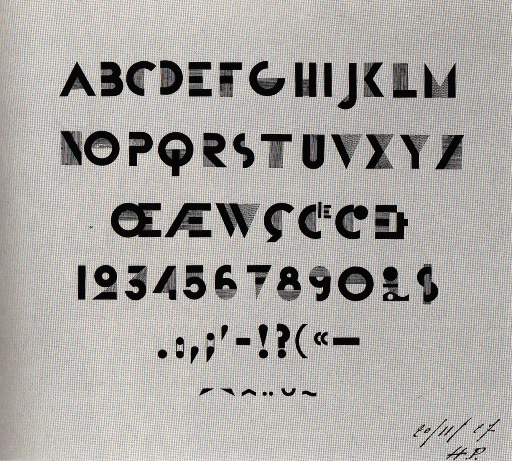
- Block letters are an example of technology dictating design–in the Wild West the letters for printing presses were carved out of wood. The letters of the first typewriters were set in this style.
- What is the future of calligraphy in the age of AI? If the past is anything to go by, wherever there is a human, there will always be a need for leaving one’s mark.
The Merriam-Webster dictionary defines calligraphy as “a. artistic, stylized, or elegant handwriting or lettering, b. the art of producing such writing.” Britannica calls it, “the art of beautiful handwriting,” and goes on to say that, “In the Middle East and East Asia, calligraphy by long and exacting tradition is considered a major art, equal to sculpture or painting. In Western culture, the plainer Greek-and-Latin-derived alphabets (…) have tended to make handwriting in principle an art that anyone can practice.”

Bronze military diploma fragment, 113–14 CE, Metropolitan Museum of Art, New York City, NY, USA.
But, there is more to calligraphy than simply the words represented. Have you ever wondered, for example, why certain forms of writing remind you of particular places—like Egypt, China, or the Wild West? Or time periods—like the Roman Republic, or the Middle Ages, or the Arts and Crafts? Have you ever heard, or read in a novel, about someone’s strong, confident hand? Or, for example, have you thought about why certain official documents—such as certificates, diplomas, or maps—are usually lettered in a similar style?

Preamble of the US Constitution with the first line written in Gothic style letters. The Ohio State University.
Calligraphy That Fits the Need
Margaret Shepherd had similar questions.
Like many beginners in calligraphy, I was happy at first to simply copy alphabets from the bygone Roman Empire, the Middle Ages, and the Renaissance. They teach the basics of letter construction and map the roots of today’s alphabet, while they evoke the time and place of the scribes who wrote them.
As I learned more about these traditional letters in pen and ink, however, I kept wondering “What about now!?” and “What about here?!”
Margaret Shepherd, Learn American Calligraphy, Skyhorse, 2024.
This is the opening of Margaret’s newest book, Learn American Calligraphy. She goes on to say, “The mismatch between words from the New World and alphabets from the Old World left me unsatisfied. Instead of sticking with formal alphabets from the past, I wanted to include calligraphy from my own era and country.”

Colonial currency featuring a combination of old and new hands, National Numismatic Collection at the Smithsonian Institution, Washington, DC, USA. Photograph by Godot13 via Wikimedia Commons (public domain).
Proper Calligraphy?
In the chapter on Gothic script, Shepherd mentions that Gothic lettering came to symbolize everything the colonists had wanted to escape when they left the Old World—authoritarianism, persecution, unquestioned hierarchies, and inflexibility. Yet, despite those conflicts, early Americans returned to Gothic in different revivals throughout the years, even using Gothic in such important documents as the Preamble to the Constitution! Maybe it was precisely because Gothic symbolized authority, power, and firmness, that American writers continued to use it. Or, perhaps, it was because they were still trying to figure out who they were as a young nation.
Such fascinating dichotomies prompted Shepherd to examine calligraphy in a whole new light—not the calligraphy that we have been conditioned to call “proper,” or “the right way.” Instead, she became interested in the calligraphy that people are using today to tell their own stories.
Calligraphy to Communicate
The truth is that calligraphy communicates many more ideas and concepts than we initially perceive. When we engage with a word, we tend to go straight to decoding the letters as symbols to glean the intended meaning. Calligraphy introduces another element on a more subconscious level that carries messages beyond the surface word plane. The ability to exchange ideas in this deeper plane comes from a very rich, cultural source that we have all inherited, making these discoveries unexpected, and our communications brimming with meaning.
Calligraphy opens a window into the politics, religion, and culture of any place you visit in this book, framing the historical forces, as well as individuals, that shape what gets written.
Margaret Shepherd, Learn American Calligraphy, Skyhorse, 2024.
Cultural Differences in Calligraphy
There are as many calligraphic styles as there are people, and they all are looking to fulfill the same objectives of legibility, communication, and self-expression. These different typologies were born from the needs of their time. As technology continues to specialize, we can let go a little of our focus on the mechanics of making letters, and pay more attention to their meaning.
Through the following examples, we will look at calligraphy doing double duty—making beautiful words, and telling us about interesting people and how they go about their daily lives. These calligraphic designs evolved from old-world styles and are used widely today, adapted to suit our modern needs. These are examples of letters we see and use in our everyday lives, with a great past, and the sky’s the limit for their future!
1. Gothic and Its Various Revivals

Gothic Panel in Boston’s Old South Church, Boston, MA, USA. Cannundrum.
Gothic calligraphy was born during the Middle Ages, dominating the written landscape in Northern Europe for some 400 years. In Spain, the Moorish influence saw the letters soften their corners, widen the bodies, and lengthen their swashes. It was this version of Spanish Gothic that the conquistadores brought to America. In Europe, however, Gothic began to be eclipsed by the advent of Roman capitals. By the time the Puritans arrived in North America and began printing their own books, these were set in Roman type.
In America, Gothic reached new audiences and dimensions through modern technologies that allowed the development of more elaborate and ornamented letters. The use of this style of writing in advertising made sure that Gothic was widespread and recognizable.
Another revival of Gothic calligraphy came in the form of Goth letters. Goth has an edgy aesthetic, which letter artists have embraced and further developed. They have accentuated the verticality of letters (just like in Gothic architecture), lengthened descending strokes, and added decoration to individual letters. A well-known example of Goth style is the logo for Monster, one of America’s most popular energy drinks.
2. Graffiti

Graffiti at The Houston Food Park, 2013, Houston, TX, USA. Photograph by Nimra Harmon via Houston History.
The word graffiti comes from the Italian graffiato, meaning scratched. It designates writing scribbled illicitly in a public place, and it has been around since the beginning of human communication. Graffiti’s character as an illegal activity traces back to Roman times. It has been discovered throughout the empire in such famous places as Pompeii itself.
Graffiti began to deeply influence American art and fashion during the 1970s, a time when suburban prosperity contrasted with urban decay. This art form gave a visual language and a vehicle for small groups in the cities to be heard, seen, and express their views. Just like in Rome, or even in the Great Pyramids, graffiti during this time also featured names and slogans particular to their creators.
Depending on the writing material, graffiti has developed into several different styles. By using a flat marker, artists could write in a style very reminiscent of those old, medieval styles that are so entrenched in the public consciousness. If the material is spray paint, monoline letters are quick to do. If the paint happens to drip, the message achieves a whole new dimension of aesthetic and idealistic communication.
Graffiti, according to The New York Times, went “from vandalism to art to nostalgia.” By the late 1990s, it was tame enough to provide art for galleries, typefaces for advertising, and logos for hip urban fashion.
Margaret Shepherd, Learn American Calligraphy, Skyhorse, 2024.
Today, we see graffiti even in designer handbags.
3. Handwriting

Selection of Timothy Matlack’s handwriting, from a 1761 letter to Haydock Bowne. The New York Historical.
Americans have their own special handwriting, which came from old-world calligraphy but developed along its own path. Social mobility, marketplace forces, and new materials transformed it into a unique compromise between the ideal and the real.
Margaret Shepherd, Learn American Calligraphy, Skyhorse, 2024.
Millennials and older generations who grew up without the ubiquitous computer in our houses can remember a time when we were taught cursive handwriting. In this category, there are several styles, such as Copperplate, particularly suited for engraving, Spencerian, Cursive, Palmer, and their cousin the Italic revival.
In the 2000s, when computers had reached most markets and households, we saw a propensity for letting go of handwriting styles and embracing print. Print mimicked computer fonts and was, arguably, easier to read.
Today, as we move on to the age of AI, where many of us are grappling with questions of where our skills fit in society, we are once again embracing the charm of imperfection. What we consider modern calligraphy today has come to represent a certain level of elegance and sophistication. A new generation of calligraphers are putting their knowledge to use creating wedding suites and stationery for formal events. Only a few years ago, a handwritten invitation would have been considered quaint, charming, but not worthy of a formal event like it is today.
4. Roman Revivals

Title page of the Bay Psalm Book, 1640, Beinecke Rare Book and Manuscript Library, CT, US. Photograph by MarmadukePercy via Wikimedia Commons (public domain).
Long before the Roman capitals first crossed the Atlantic, they had already been revived in Europe half a dozen times, from 5th-century Rustica to Charlemagne’s 9th-century minuscule to humanist hands of the Renaissance.
Margaret Shepherd, Learn American Calligraphy, Skyhorse, 2024.
The Puritans brought Roman capitals to America and widely used them. They went everywhere—from the first typeset version of the Declaration of Independence, to plaques on civic buildings to monuments to gravestones. The Bay Psalm Book from 1640, America’s first printed book, was typeset using Roman letters.
The Romans developed Roman capitals, also called square capitals, to be used primarily for inscriptions on monuments, buildings, and official documents. In this sense, the style’s main function was to be legible at a distance. Later generations of calligraphers who have not been constrained by this use of their letters, have been able to adapt them for different uses and different times. Guidelines such as letter widths or distance between letters (also known as kerning) have relaxed in subsequent adaptations, and more organic lines and elements that would have been difficult to add when carved in stone, have been incorporated.
New regimes love to wrap themselves in the mantle of Roman capitals, not just because they are easy to read, but because for two thousand years they have symbolized a break from the compromises of the recent past and a return to older, purer, more civilized ideals.
Margaret Shepherd, Learn American Calligraphy, Skyhorse, 2024.
4.1 Art Deco Letters
Among Roman revivals we have two styles that art lovers recognize very well—the Arts and Crafts and Art Deco letters.
A. M. Cassandre designed Art Deco letters in France in the 1920s. These letters are characterized by being used mostly in all caps, their highly geometric nature, as well as the high contrast between thin and thick strokes.
Current famous examples of the Art Deco style we can still see today in the logo of The New Yorker magazine, and the facade of the Guggenheim Museum and all its visual identity.
A. M. Cassandre, Le Bifur (Bifur Typeface), 1927. Artist’s website.

Rea Irvin, The cover of the first issue of The New Yorker, 1925.

Frank Lloyd Wright, Solomon R. Guggenheim Museum, 1956–1959, New York City, NY, USA. Photograph by Jean-Christophe Benoist via Wikimedia commons (CC BY 3.0).


Bifur Typeface
Cassandre designed such iconic typefaces as the Yves Saint Laurent logo, Le Peignot, and the Paris Airport typographic logo. Bifur is one of his most famous Art Deco typefaces.
The New Yorker Logo
The typographic logo of The New Yorker has had little alteration since the magazine’s beginning. This is a famous use of Roman revival style letters that became their own typeface, still used by the magazine, and called Irvin after the designer.
The Facade of the Guggenheim Museum in New York
Frank Lloyd Wright routinely integrated typography into his architectural designs. The whole system of Guggenheim signage is based on his lettering on the museum’s facade.
4.2 Arts and Crafts Letters
Arts and Crafts proponents, in their desire to break from years of industrialization and help society return to a less commercialized, more traditional aesthetic, found Roman letters particularly suited for their purpose. William Joseph “Dard” Hunter was an American authority on printing, paper, and papermaking, and the artist responsible for originating the Arts and Crafts all-caps style we know today.

Dard Hunter design for an Elbert Hubbard aphorism (1908). Photograph via The Poetry of Sight.
5. Block
Block letters are an excellent example of how technology dictates design. Two interesting variations of the Block letters are Slab alphabets and Typewriter styles.
From 1860 to 1970, hand-painted American banners, signs, and showcards were everywhere, from corner grocery stores to national convention halls. Professional sign painters helped the new consumer economy to expand by creating the advertisements that prodded customers to spend money. In their heyday, they maintained busy workshops, organized labor unions, and gave whole neighborhoods a distinctive visual personality.
Margaret Shepherd, Learn American Calligraphy, Skyhorse, 2024.
5.1 Slab Alphabets

Wanted Poster, 1882, Autry Museum of the American West, Los Angeles, CA, USA. Museum’s website.
The Slab alphabets are almost synonymous with the American West because they were created under conditions that were quite unique to that time and place. Wood type saw its heyday from 1830–1910, a time of great expansion, particularly in the form of the railroad. Wood type was cheaper to create and did not have as much constraint in size as metal type did. America’s forests supplied plenty of hardwoods for carving into type. New techniques for producing pulp from softer woods made large paper cheaper, as well.
5.2 Typewriter Letters
The Typewriter style survives to our day. Considering that early typewriters began to emerge in the 1830s, it is no surprise that Typewriter font resembled Slab letters. Now that most of our typing is done by computer and there are few design constraints in what letters we can produce, these earlier styles evoke nostalgia and transport us immediately to a different period.

Example of Highway Alphabet, Manual on Uniform Traffic Control Devices (MUTCD). U.S. Department of Transportation.
An important variant of the Block letters is the Highway Alphabet. With the development of extensive road networks and the increase of land travel, hand-painted signs eventually became visual clutter and were distracting for drivers. The alphabet used on highway signage was born to fulfill an informational need and its main purpose, like earlier Roman capitals, is legibility.
Today, typefaces on the signs that are allowed on highways have been honed by intensive research, including where to capitalize them, how to space them, and what colors are most readable.
Margaret Shepherd, Learn American Calligraphy, Skyhorse, 2024.
The advent of Artificial Intelligence has made creatives in all fields question the purpose of our art, as well as its future. This is not the first time humanity has seen a revolution of similar magnitude. A few decades ago we had the home computer which, in its time, saw users and professionals adapt their conventions and evolve their skills to suit the changing landscape.
The Future of Calligraphy in the Age of AI
Earlier than that, the Arts and Crafts movement was born as a response to similar conditions in an age where machines were threatening to take over work that was traditionally done by hand. Impressionism was, in part, responding to the time’s preoccupation with optics and the development of photography. And even earlier than that, Gutenberg’s printing press brought literature to millions of people who had never had access to it.
In the same way, calligraphy has been evolving from its mainly utilitarian function of communicating a message, to the realm of self-expression, just like art. When our visual environment is saturated with print everywhere, calligraphy always makes a statement. As we saw in the examples above, calligraphers respond to needs in unique and ingenious ways that fulfill needs and evolve society in ways that can’t always be quantified.
Calligraphy Looking Toward the Future

Cover of Margaret Shepherd, Learn American Calligraphy. The Complete Book of Lettering, History, and Design, 2024, Skyhorse, 2024.
Margaret Shepherd has made it her life’s work to look at calligraphy from an academic lens—not just at the work itself, or at the message, but also at the circumstances that generate that work. By looking at calligraphy’s anthropological repercussions, we learn more about ourselves as individuals and also as members of the human family.
Just like art is a product of its creator and its time, so is calligraphy. As we look at art to feel something, we also look at calligraphy to be moved and to feel connected. We do calligraphy to leave our mark in a world that sometimes feels impersonal and shallow. Calligraphers, just like artists, are seeking to leave an impression of how they see the world, and when, and why.
Can calligraphy see us through the next age? We are positioned in a unique place to observe the transition, and calligraphers of the future will be there to tell the story.
I was privileged to interview Margaret and hear her thoughts on all things calligraphy! Her book Learn American Calligraphy, where the examples shared in the article originated, is part of a series of books that examine calligraphy in its different societal manifestations. Its counterpart, Learn World Calligraphy, examines the evolution of calligraphic styles in the world at large. Learn Calligraphy brings it all home by focusing on how the reader can make calligraphy their own.
I asked Margaret, “What can people do to develop their eye?”
She replied, “I really think you look at things differently when you’ve tried them out with a pen in your hand. I can’t emphasize that enough, just try it out. Take a felt marker and maybe take a picture of something you like and think: how did they do that, how did they make that, how did the pen shape that, maybe even one letter?
“Part of what I was trying to get people to see was that you could even take a typeface and sort of reverse engineer it with a pen. Own it. Calligraphy is about small differences and you are the person in control.
“I see that there is a trend to making things by hand. I think we are going back to it. People crave that and not just because the person looking at it sees that it’s handmade and likes it better. I think the person who is making it just feels this wonderful connection.
“Calligraphy is also used for meditation. I could work slowly, think about it, look at it, just lettering a page of some simple quotation and giving yourself a couple of hours to just stil still and letter. People are amazed (…) at how calming and soothing it is.
Calligraphy is there to try.”
My hope is that this article will inspire you, too, to look around, try new things, and use your creativity to say what your words alone can’t. Many thanks to Margaret Shepherd for her time and wisdom, Lana Scheurle from Sarah Hall Productions for arranging the interview, and the team at DailyArt Magazine for encouraging us writers to pursue art in all its forms.


#/media/File:US-Colonial_(MA-87.15)-Massachusetts-1_May_1741_OBV.jpg)