
Azulejo: Macau’s Inheritance from Portuguese Art
In the Pacific world and throughout the Lusophone community, Macau is a special place. The streets of Macau exude the subtle, melancholic sense of...
Guest Author 28 July 2025
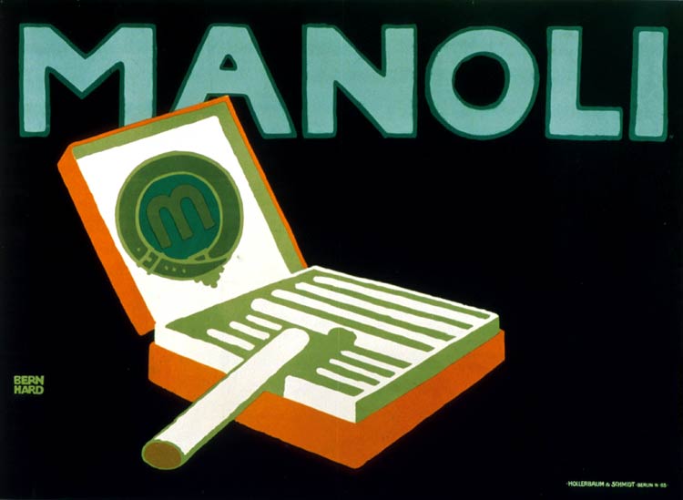
Lucian Bernhard, Manoli, 1910, The Museum of Modern Art, New York, NY, USA.
By the beginning of the 20th century, young designers had moved on from the intricate forms of Art Nouveau and Arts and Crafts. The first golden age of modern poster design, Plakatstil or Sachplakat, arrived around the 1900s in Germany; ideas were centered on innovative and novel techniques.
Plakatstil (poster style) and Sachplakat (object posters) were two of the most influential modern poster design styles of the 20th century that arose in Germany; they relied on symbols and shapes rather than textual descriptions to promote an idea. The people immediately recognized the poster’s subject due to its bold, eye-catching typeface, simple central image, flat background color, and rejection of anything pretentious or ornate.
In 1906, Lucian Bernhard created posters for Priester Match as part of a poster competition sponsored by the company.
With little time to develop his work, he relied on instinctual design selections to promote matches, concentrating on symbols and forms rather than complex illustrations. Bernhard promoted the brand name Priester with bold, straight purple typography. The key item, the matches, is emphasized in the poster design, and the shapes and objects are simplified with a flat black backdrop.
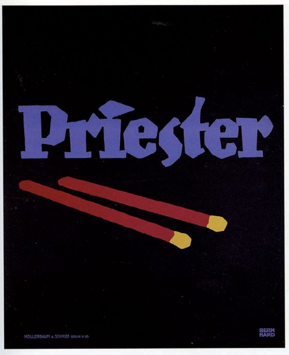
In contrast to intricate and lengthy Art Nouveau posters, Bernhard’s work is marked by bold letterings, basic objects, and strong, vivid colors, as well as the poster’s lack of a border. The method of communication in this poster is no longer symbolic but rather a simple and direct statement about what the audience would most like to know about what he is presenting. The lack of other distracting or undesirable factors quickly grabs the viewer’s attention. This persuasive commercial drew a significant reaction and made Bernhard, a little-known young artist who developed Plakatstil, famous.
Bernhard’s approach sparked a revolution in commercial advertising and promoted a more contemporary perspective on poster art in pre-war Berlin. The most notable representatives include Otto Baumberger, Han Rudi Erst, Julius Gipkens, Julius Klinger, Hans Lindenstadt, Karl Schuldig, Emil Cardinaux, and Sven Henrikksen.
You see with your eyes, not your brain.
Hans Rudi Erdt (1883–1918), a Berlin-based artist, used a minimalist approach to design similar to that of Lucian Bernhard, stressing flat colors, basic forms, and bold typography. Erdt’s designs were less literal than those of Bernhard, who focused on the products being marketed. His commercial for Opel autos, for example, does not portray the vehicles themselves. The brand name appears above and below the image of a man wearing driving goggles and a hat.
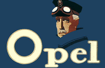
Hans Rudi Erdt, Opel, 1911. Wikimedia Commons (public domain).
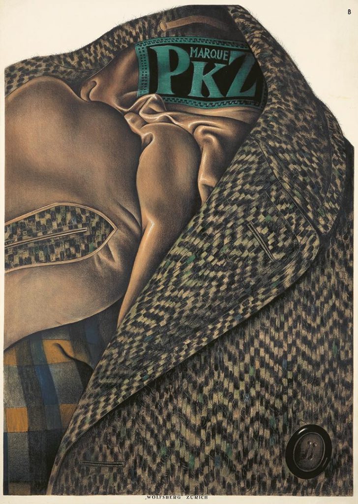
In 1917, Otto Baumberger (1889–1961) began frequently working for a Swiss clothing company PKZ. The poster below is not only his finest work for the company but a milestone in the history of posters. The depiction of the tweed coat is so close to photorealistic that we can nearly feel the fabric. Baumberger introduced a novel advertising strategy by ingeniously inserting the poster’s text as a label on the coat.
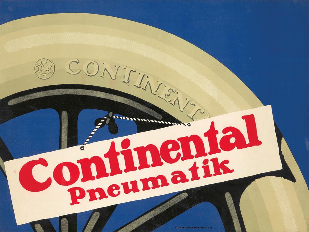
In Germany in 1871, Continental Tires was established. The brand was extremely successful not only in Germany but also in France, where they built a massive plant and hired Leonetto Cappiello to design posters advertising their products. Additionally, they also recruited renowned German artists. Julius Gipkens (1883–1968) was a self-taught poster artist who was highly active prior to and after World War I. He was employed by the prestigious business Hollerbaum & Schmidt, whose roster of artists included Lucian Bernhard, Hans Rudi Erdt, Julius Klinger, and Ernest Deutsch. Gipkens’ posters are an effective extension of Bernhard’s style, displaying a tire section with a placard dangling from its air valve.
The 1910 Steinway & Sons poster by Bernhard was a clear example of the Sachplakat style, with its flat product depiction, bold typography, and monochrome backdrop. Karl Schulpig’s (1884–1948) well-executed design is unquestionably a “tribute” to Bernhard, capturing the mood of the original poster but with slightly more piano detail and additional text.
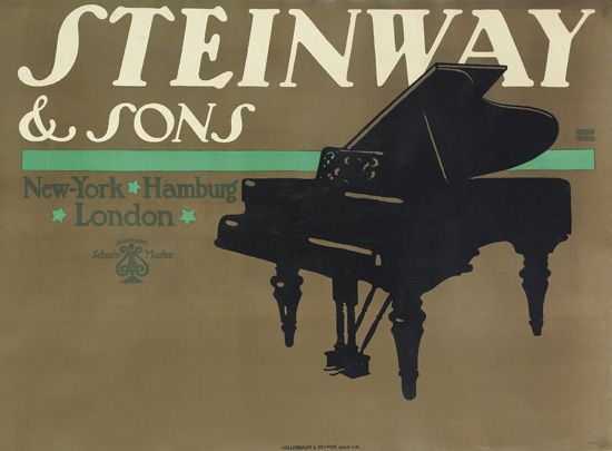
Lucian Bernhard, Steinway&Sons, 1910. Artnet.
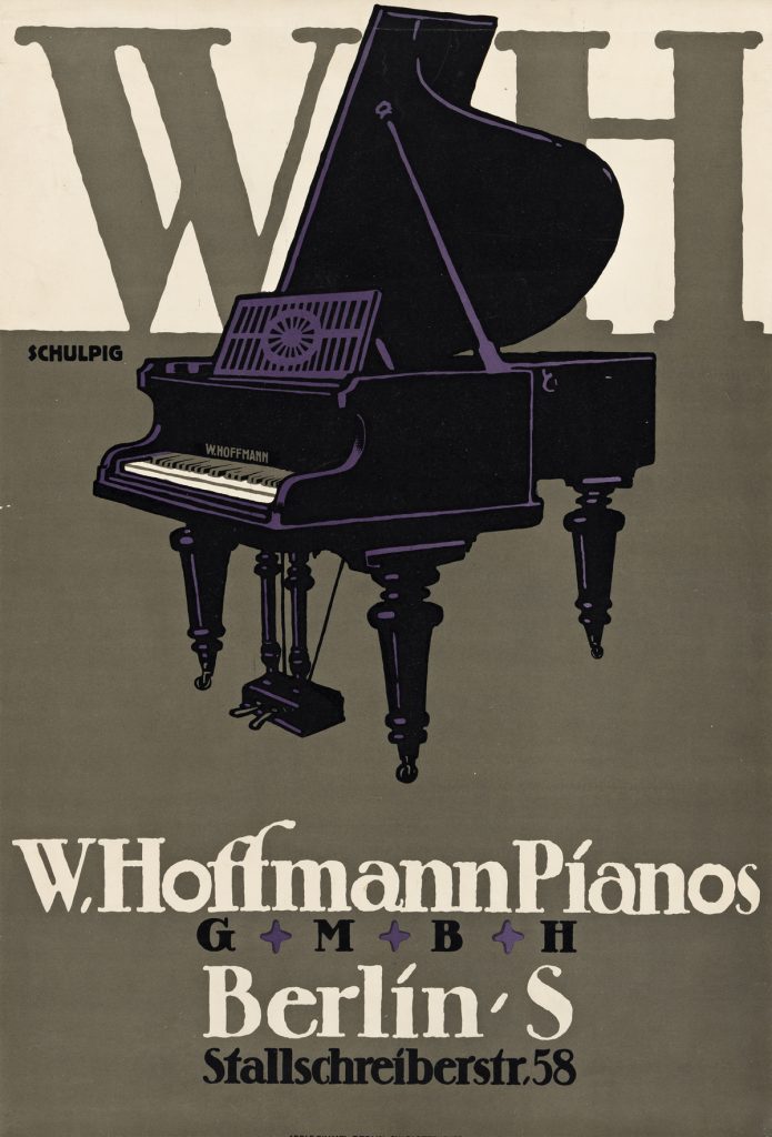
Karl Schulpig, W. Hoffmann Pianos, 1912. Swann Auction Galleries.


With its flat product illustration, strong lettering, and monochromatic background, Bernhard’s 1910 Steinway & Sons billboard was a blatant example of the Sachplakat design.
Unquestionably a “tribute” to Bernhard, Karl Schulpig’s expertly created design captures the vibe of the original billboard while adding a little more piano detail and text.
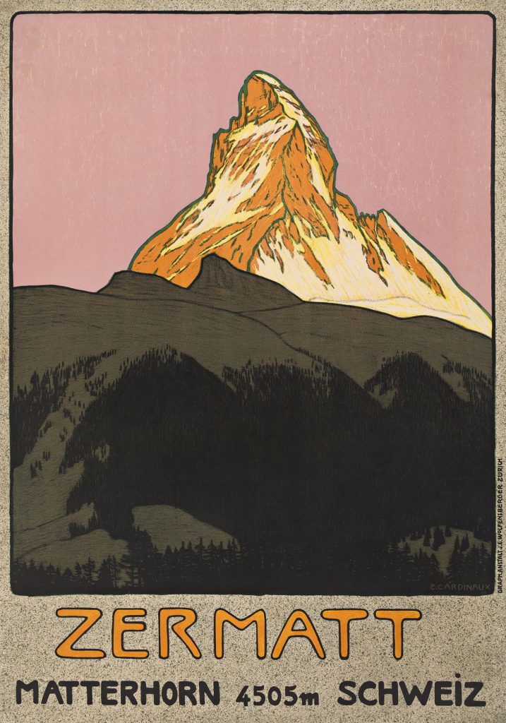
The Zermatt Tourist office commissioned Emil Cardinaux (1877–1936) to create this poster to promote the Zermatt ski resort. The artwork’s text comprises four words in a casual sans-serif typeface. This font matches the hand-drawn, conversational tone of the piece by making it appear more approachable. The orange hues of the name Zermatt connect the bottom of the poster to the Alps’ highest point. This poster echoes the German Plakatstil from before World War I and foreshadows the Swiss Realism of the early 1920s by its boldness, simplicity, and strength.
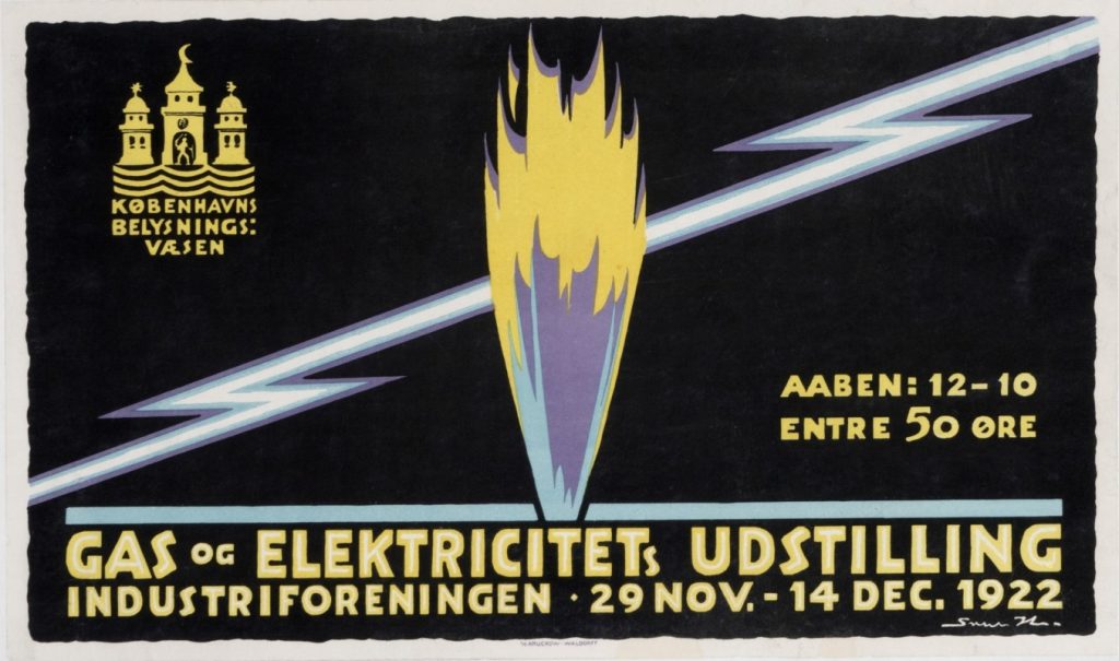
In the 1920s, Sven Henrikksen (1890–1935), a Dane schooled in Copenhagen, contributed to the development of poster art in his nation. This spectacular poster for a Copenhagen gas and electricity show takes little more than a lightning bolt and a burst of flame. The design was created in the Plakatstil, which defined the appearance of simple and straightforward modernist advertising in Germany and Switzerland around the turn of the 20th century.
One is instantly reminded of Lucian Bernhard’s iconic 1906 poster for Priester matches by this graphic advocating little, incredibly simple charcoal briquettes for heating. Niklaus Stoecklin (1896–1982) bolsters realism by illustrating the splintering of the wood along the matchstick with photographic precision.
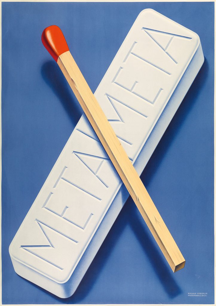
Niklaus Stoecklin, Meta, 1941, The Museum of Modern Art, New York, NY, USA.
Due to World War I, which greatly disrupted business and the economy, Plakatstil essentially ended in 1914. Poster artists were obsessed with increasing patriotism during the war, and after the war, new techniques arose, most notably Art Deco. Plakatstil had little influence outside of Europe since it was so short-lived.
The presentation of some representative posters, mainly by German Plakatstil designers and other notable European Sachplakat artists, aims to evoke the ephemeral style of these trends in design, while also considering its legacy today. We can still learn from the posters’ dramatic emphasis on product advertising. The use of isolated images or value symbols in Plakatstil/Sachplakat was the forerunner of the “less is more” strategy in contemporary graphic design.
Albert Exergian’s minimalist poster series for iconic American TV shows were inspired by Sachplakat and were condensed to a single-element object. Even after a century, the spot-on Plakatstil posters still hit us right in the heart.
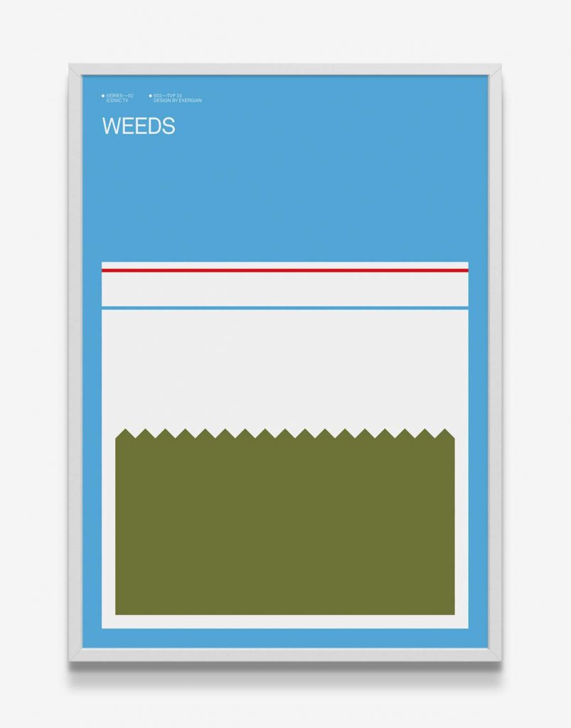
Albert Exergia, Weeds, 2010. Iconic TV minimalist Poster Series.
“1900s: Plakatstil.” A Timeline of Design History, January 31, 2019.
Stephen Eskilson. Graphic Design: A New History. New Haven, CT: Yale University Press, 2019.
Steven Heller. “The Object Poster, the Visual Pun, and 3 Other Ideas That Changed Design.” The Atlantic. Atlantic Media Company, April 12, 2012.
Pat Kirkham. “Reassessing the Saul Bass and Alfred Hitchcock Collaboration.” West 86th: A Journal of Decorative Arts, Design History, and Material Culture 18, no. 1 (2011): 50–85.
Philip B. Meggs. Meggs’ History of Graphic Design. New York: Wiley, 2016.
DailyArt Magazine needs your support. Every contribution, however big or small, is very valuable for our future. Thanks to it, we will be able to sustain and grow the Magazine. Thank you for your help!

Art historian and curator specializing in object-based research, museum interpretation, and public-facing art writing, with interests spanning early modern European art, material culture, and cross-cultural visual histories.
In the Pacific world and throughout the Lusophone community, Macau is a special place. The streets of Macau exude the subtle, melancholic sense of...
Guest Author 28 July 2025
As modern life demanded new ways of living at the beginning of the 20th century, the Bauhaus responded with radical designs. We explore 10 iconic...
Lisa Scalone 20 June 2025
Decorative snuff boxes were highly ornate containers for powdered tobacco, the consumption of which was a fad that swept the 17th century. By the age...
Maya M. Tola 6 July 2026
Does calligraphy have a place in the age of AI? Do we still need handwritten words when we can just as easily print them from a computer? What about...
Ledys Chemin 7 April 2025


